How we make this list: we compare pricing pages, product documentation and public user reviews. Rankite is independent; if a vendor ever pays for a featured spot, that listing is clearly labeled Partner.
Key takeaways
- Power BI at $14 per user a month is the value pick for companies already on Microsoft 365; Tableau Standard from $15 is the classic analyst favorite.
- Looker Studio is free and surprisingly capable for Google-centric teams, but governance features are thin.
- Zoho Analytics and Databox are the budget plays with real free tiers; both cover the basics well.
- Domo and Sisense are the heavy platforms for companies that need governed data plus AI features, with quote-only pricing to match.
- Klipfolio and Geckoboard specialize in TV-style KPI boards and team visibility, with flat monthly pricing and unlimited viewers on higher plans.
A finance VP at a 200-person company once told me her Monday routine: export five reports, paste numbers into a spreadsheet, and spend an hour making sure the charts agree with each other. She bought dashboard software the week she realized her spreadsheet disagreed with the sales team's. An executive dashboard exists to kill that Monday routine. The tools below all build dashboards, but they differ sharply in price, who builds the dashboards, and what happens when the CEO asks why a number changed.
Quick comparison
| Tool | Best for | Starting price | Free plan |
|---|
 Microsoft Power BI Microsoft Power BI | Companies already running on Microsoft 365 | $14 per user/month (Pro, paid yearly) | Yes (free account, no sharing) |
 Tableau Tableau | Analysts who want the best visual exploration | $15 per user/month (Tableau Standard, billed annually) | Yes (Tableau Desktop Free Edition, local only) |
 Looker Studio Looker Studio | Free dashboards for Google Workspace teams | Free | Yes |
 Domo Domo | Companies that want one platform for data, dashboards and AI | See website | Free trial |
 Sisense Sisense | Embedding analytics inside your own product | See website | Free trial |
 Klipfolio Klipfolio | Custom-built KPI dashboards with predictable flat pricing | $120 per month (Base, billed annually) | Free trial (14 days) |
 Databox Databox | Simple KPI scorecards the whole company can read | Free; paid from $99/month | Yes |
 Geckoboard Geckoboard | Live KPI boards on office TVs and team screens | $79 per month (Essentials, billed annually) | Free trial (14 days) |
 Zoho Analytics Zoho Analytics | Budget BI with deep business-app connectors | See website | Yes (2 users, 10K rows) |
Is your product missing or out of date?
We review this list regularly. Vendors can request a listing, send updated pricing or ask about featured placement.
The best software for creating executive dashboards
Starting price$14 per user/month (Pro, paid yearly)
Free planYes (free account, no sharing)
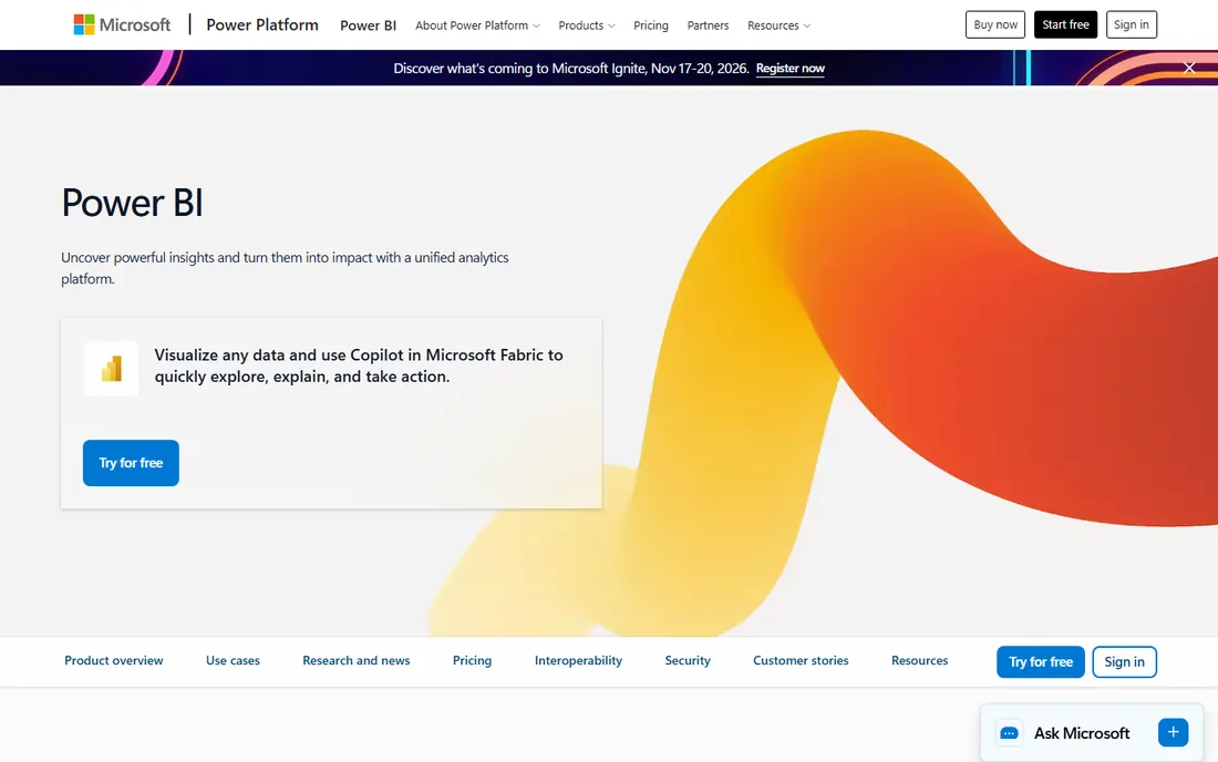
Power BI wins on price and on gravity. If your company lives in Excel and Teams, dashboards built in Power BI land in front of executives with zero friction. Pro costs $14 per user a month when paid yearly, and Premium Per User at $24 adds larger models and more frequent refreshes (48 a day versus 8).
The honest catch is the sharing wall: a free account can build reports but cannot publish or share them. Every executive who needs to open a dashboard needs a license, or you need Fabric capacity. Model memory caps at 1 GB on Pro, which is fine for executive summaries but tight for analysts working with raw transaction tables.
What we like- Cheapest serious BI per seat
- Deep integration with Excel, Teams and Azure
- Copilot features in the Fabric ecosystem
- Huge template and community library
Watch out for- Free account cannot share reports, so collaboration forces paid seats
- The licensing model (Pro vs Premium Per User vs Fabric capacity) confuses buyers
- Design polish lags Tableau
Starting price$15 per user/month (Tableau Standard, billed annually)
Free planYes (Tableau Desktop Free Edition, local only)
Tableau rebuilt its lineup around what it calls agentic analytics. Tableau Standard starts at $15 per user a month billed annually and includes web authoring, Desktop and Prep Builder. Enterprise starts at $35 and adds advanced management. Capacity-based pricing is available for Tableau Cloud if you want broad Viewer access without paying per viewer.
For executives specifically, Tableau Pulse is the feature to evaluate: it pushes metric digests and AI explanations to decision-makers who never open a dashboard. The free Desktop edition is genuinely capable for individual analysis, but it cannot publish or share, so it works for evaluation, not for a company-wide rollout.
What we like- Still the benchmark for interactive visual analysis
- Tableau Pulse delivers AI-generated metric insights
- Strong governance and a massive user community
Watch out for- All products require an annual contract
- The portfolio (Cloud, Server, Next, plus editions) is hard to navigate
- Per-user costs climb fast with Viewer-heavy audiences
Starting priceFree
Free planYes
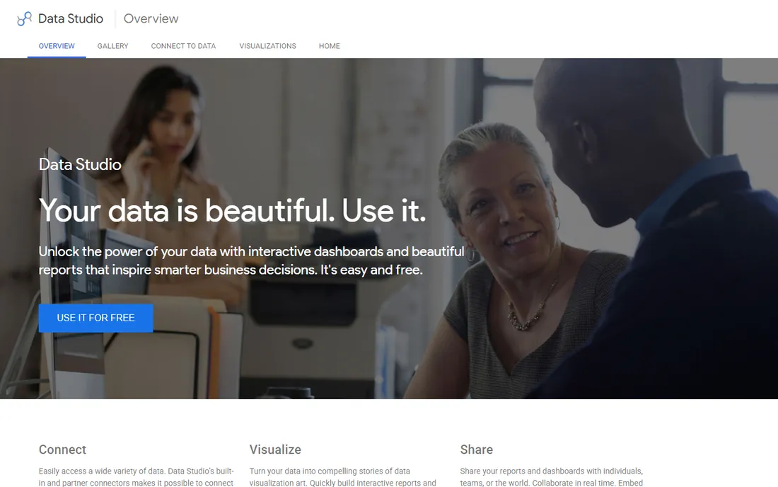
Looker Studio is the reason many small companies never buy BI software. It connects to Google's data sources in a few clicks, builds clean interactive dashboards, and shares them with a link. For a marketing or sales leader who needs a weekly view of pipeline and spend, it is often enough.
The limits show up at scale. Data blending gets slow, scheduled refresh options are basic, and there is no real semantic layer for governed metrics. If two departments define revenue differently, Looker Studio will happily show both numbers. Treat it as the right tool for teams under 50 people or as a complement to a warehouse, not as an enterprise BI platform.
What we like- Completely free with no user limits
- Native connectors for Google Analytics, Ads, Sheets and BigQuery
- Easy sharing and embedding like a Google Doc
Watch out for- Weaker data modeling and governance than paid BI
- Refresh and row limits can bite on large datasets
- Enterprise support and SLAs are not part of the deal
#4
Domo
Best for: Companies that want one platform for data, dashboards and AI
Visit domo.com
Starting priceSee website
Free planFree trial
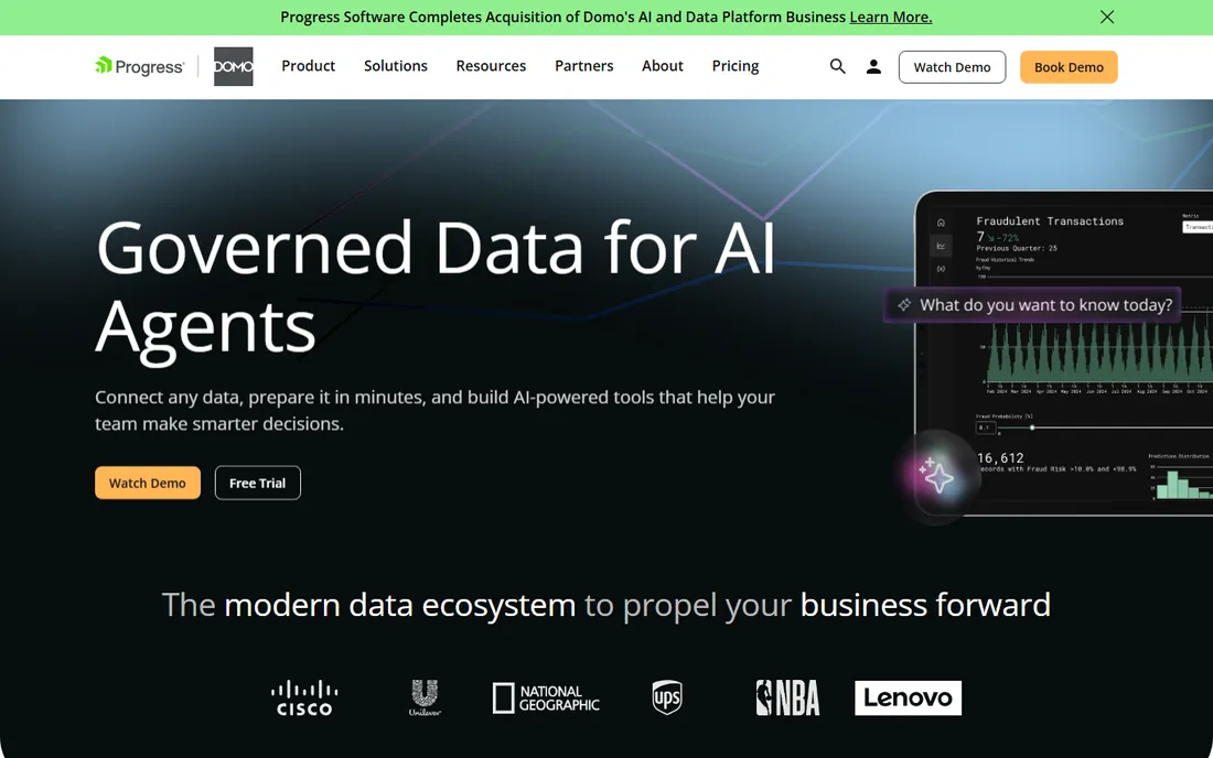
Domo pitches itself as the modern data ecosystem: connect any source, prepare data in minutes, build dashboards, and now deploy AI agents that answer business questions. The homepage highlights agents for HR benefits, competitive research and insurance claims, which tells you the ambition goes well past dashboards.
Buyer reality check: Domo sells through a consultative process, and pricing is not published. Companies that buy it usually want the full stack, including data preparation and governance, not just charts. If your need is a clean executive view of ten KPIs, start with something cheaper and come back to Domo when the data plumbing matters.
What we like- End-to-end platform from connectors to AI agents
- Strong embedded analytics
- Prebuilt AI agents for common business tasks
- Well reviewed on G2
Watch out for- Quote-only pricing with enterprise-style sales cycles
- More platform than most executive-dashboard buyers need
- Implementation takes real planning
Starting priceSee website
Free planFree trial
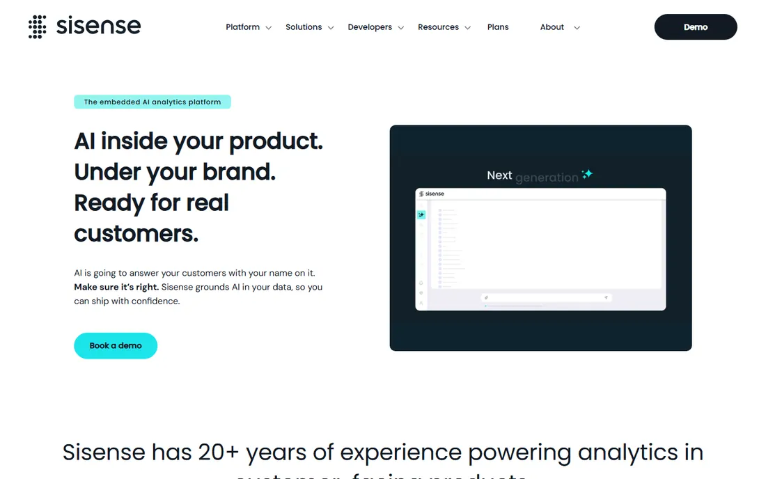
Sisense spent 20 years powering analytics inside other companies' products, and the current platform leans into that identity with AI features that answer customer questions under your brand. The governed semantics and multi-tenant architecture are the differentiators: one customer never sees another's data, and everyone works from the same metric definitions.
For a pure executive-dashboard use case, Sisense is usually the wrong shape. It shines when you need to ship analytics to your customers, not when the CEO needs a Monday revenue view. Pricing is custom, and the sales process assumes you are building a product feature.
What we like- Purpose-built for embedded and white-label analytics
- Governed semantic layer keeps metrics consistent
- Compose SDK gives developers real control
Watch out for- Pricing is quote-only and aimed at product companies
- Overkill if you only need internal dashboards
- AI features are newer and still maturing
#6
Klipfolio
Best for: Custom-built KPI dashboards with predictable flat pricing
Visit klipfolio.com
Starting price$120 per month (Base, billed annually)
Free planFree trial (14 days)
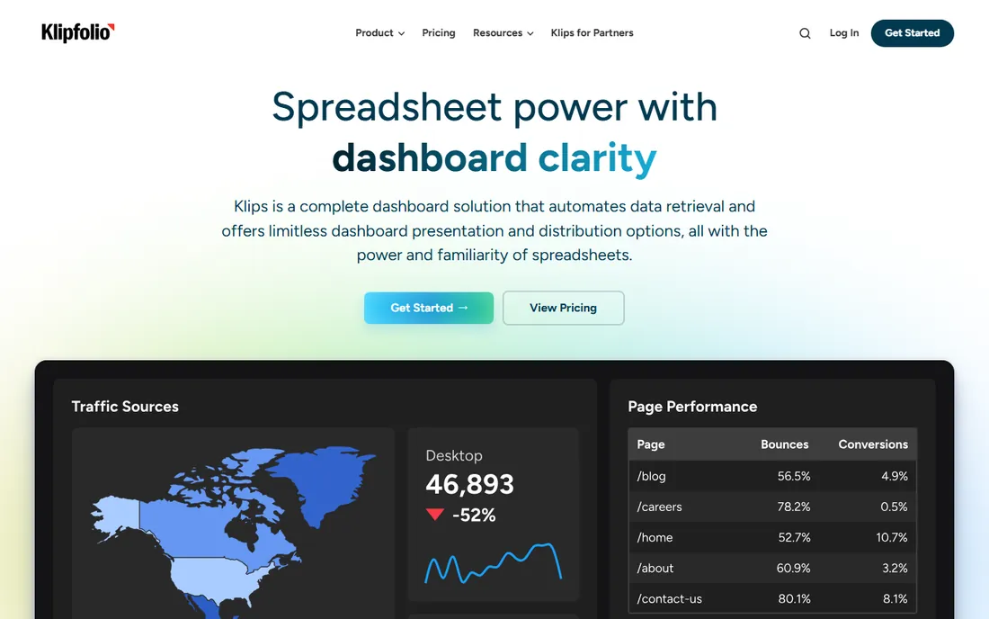
Klipfolio prices by dashboards and refresh speed, not by seats, which makes budgeting simple: Base is $120 a month billed annually for 3 dashboards and unlimited users, Grow is $190 for 10 dashboards with hourly refresh, Team is $310 for 20 dashboards with 15-minute refresh, and Team+ is $600 for 40 dashboards with up-to-the-minute refresh.
The 14-day trial needs no credit card. Support is included on all plans, with priority support and SSO available as add-ons or on higher tiers. The main decision is refresh speed: if executives need intraday numbers, the Base plan's 4-hour refresh will not cut it, and the real entry price is Team.
What we like- Flat pricing with unlimited users on every plan
- 130+ integrations
- Add your logo and publish links for sharing
- Data modeling and joins built in
Watch out for- Base plan allows only 3 dashboards with 4-hour refresh
- Meaningful speed (15-minute refresh) starts at $310 a month
- No permanent free tier
#7
Databox
Best for: Simple KPI scorecards the whole company can read
Visit databox.com
Starting priceFree; paid from $99/month
Free planYes
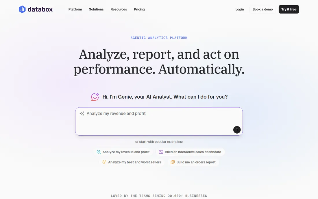
Databox positions itself as the tool for everyone who is not an analyst. The free plan includes 1 user, 3 data sources, 1 dashboard, daily sync and an AI analyst called Genie. Team Core is $249 a month for 3 users and 10 data sources, Team Scale is $399 for 10 users and 30 sources, and annual billing saves 20 percent.
What stands out for executives is the philosophy: Databox serves the people who consume numbers, while Power BI and Tableau serve the people who build them. Scorecards, goal tracking and Slack alerts are first-class. Just note that Databox does not charge per seat on team plans, so sharing with leadership does not inflate the bill, a real advantage over per-user BI pricing.
What we like- Real free plan with an AI analyst included
- No per-seat pricing on team plans
- 130+ native integrations
- Scorecards, alerts and scheduled snapshots built for non-analysts
Watch out for- Not a full BI tool for deep analysis
- Data source and AI credit limits force plan upgrades as you grow
- The Analyst solo plan details sit behind the pricing flow
Starting price$79 per month (Essentials, billed annually)
Free planFree trial (14 days)
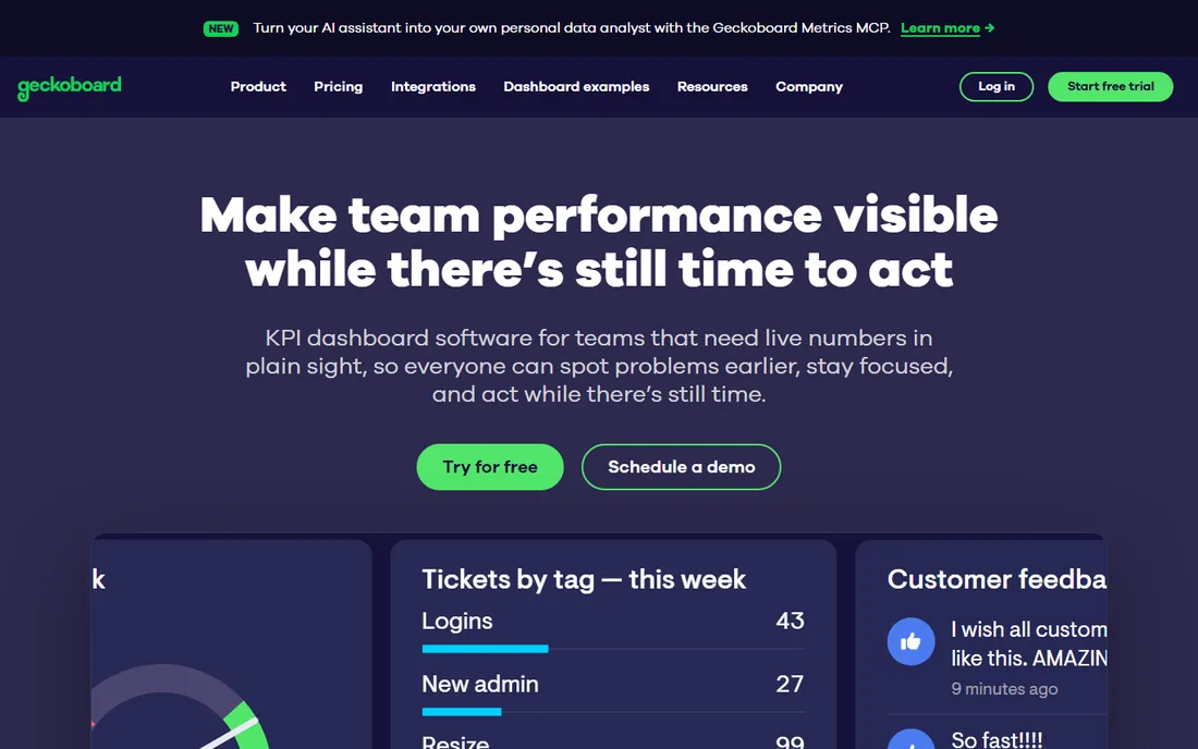
Geckoboard owns the office-TV use case. Essentials starts at $79 a month billed annually with unlimited integrations and real-time updates, and you can add dashboards at $24 each. Performance at $319 a month adds alerts, drilldowns and dashboard templates for rolling the same view across teams.
Sharing is generous: unlimited viewers, sharing links, and scheduled snapshots to Slack, Teams or email mean the numbers reach people who never log in. The tradeoff is analytical depth. This is a visibility tool, not an exploration tool. Buy it when the goal is keeping metrics in front of the team, not when analysts need to slice data.
What we like- Built for glanceable real-time dashboards
- TV mode with remote management and rotation
- Slack and Teams snapshots and alerts
- Unlimited viewers
Watch out for- Not designed for deep drill-down analysis on the base plan
- 14-day trial only, no free tier
- White labeling is not supported
#9
Zoho Analytics
Best for: Budget BI with deep business-app connectors
Visit zoho.com
Starting priceSee website
Free planYes (2 users, 10K rows)
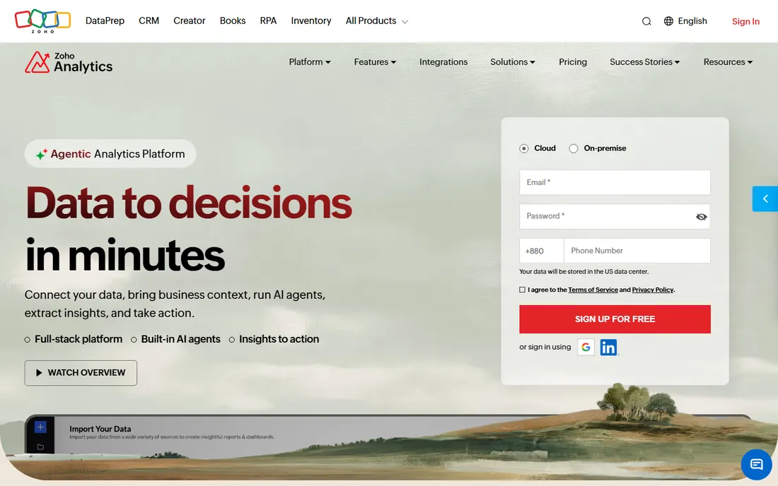
Zoho Analytics is the quiet value pick in BI. The free plan covers 2 users, 10,000 rows, 5 workspaces and unlimited reports and dashboards, which is enough for a small company to run real reporting. Paid plans scale by users and rows, from half a million to 50 million rows, with 50+ business-app connectors and prebuilt reports for each.
The Ask Zia AI assistant handles conversational questions and automated insights, and the platform covers data preparation, forecasting and what-if analysis that usually costs far more elsewhere. The main watch-out is the row counting: rows across all tables and workspaces count toward the limit, so growing companies should size the plan against actual data volume, not user count.
What we like- Genuine free plan with unlimited reports and dashboards
- 50+ business-app connectors with prebuilt reports
- Ask Zia AI assistant for conversational analysis
- Strong value for Zoho shops
Watch out for- Paid pricing sits behind plan selectors and is hard to compare at a glance
- Row-based limits require watching as data grows
- Interface feels dense next to Tableau
How we chose
We looked for tools that are actively sold and supported in 2026 and that a non-technical executive could plausibly use or receive output from. We read each vendor's own pricing page and product documentation for current plans, limits and free tiers, and cross-checked buyer experience on G2, Capterra and Reddit. We skipped pure data-visualization libraries, dead products, and platforms with no credible dashboard offering. Nobody on our team ran a hands-on trial; the write-ups reflect published capabilities and reported user experience.
What an executive dashboard has to do differently
An analyst dashboard answers questions. An executive dashboard prevents them. That means five or fewer KPIs per screen, plain-language labels instead of field names, and one-click access with no login maze. Before you buy, mock up your actual Monday-morning screen in the trial and show it to the executive who will use it. If they cannot read it in ten seconds, the tool is wrong or the design is.
Governance is the second difference. When two dashboards show different revenue numbers, executives lose trust in all dashboards. Tools with a semantic layer or governed metrics (Tableau, Domo, Sisense, Zoho) solve this structurally. Cheaper tools solve it socially, by agreeing on definitions in a meeting. Either works, but only if someone owns the definitions.
Finally, plan the delivery, not just the dashboard. Executives read email and Slack more than BI portals. Scheduled snapshots, mobile apps and TV mode determine whether the dashboard gets used. Geckoboard and Databox treat distribution as the product; with Power BI and Tableau, you configure it.
Per-seat versus flat pricing
Per-seat pricing (Power BI, Tableau) punishes broad sharing: every executive viewer is a license. It rewards focused teams where a few builders serve many consumers through other channels, or where capacity-based pricing covers viewers. Flat pricing (Klipfolio, Geckoboard, Databox team plans) rewards broad sharing: put the dashboard on every screen and in every inbox for the same money. It punishes you if only three people ever look at it.
Do the math with your real headcount. A 30-person leadership group on Power BI Pro costs $420 a month before any analysts build anything. The same group on Geckoboard Essentials costs $79 plus dashboard add-ons. The per-seat tools earn their keep when analysts do heavy modeling; the flat tools win when the job is visibility.
Frequently asked questions
What is the best free executive dashboard software?
Looker Studio is the most capable fully free option, especially for Google-centric teams. Zoho Analytics has the best free BI plan with 2 users and unlimited dashboards. Power BI and Tableau both offer free editions, but neither allows sharing on free, which limits them for executive distribution.
How much does executive dashboard software cost?
Free tools cover basic needs. Paid plans start around $79 a month for Geckoboard, $120 for Klipfolio and $99 for Databox, while per-seat BI starts at $14 to $15 per user a month for Power BI and Tableau. Enterprise platforms like Domo and Sisense are quote-only and typically cost far more.
Power BI vs Tableau: which is better for executives?
Power BI is cheaper and easier to deploy inside Microsoft 365 companies, with better scheduled distribution through Teams. Tableau offers richer interactive exploration and Tableau Pulse for AI-generated metric insights. For executives who only consume dashboards, Power BI usually wins on cost; for analyst-driven cultures, Tableau wins on depth.
Do I need a data warehouse to use these tools?
No. Most of these tools connect directly to your CRM, accounting software, spreadsheets and ad platforms. A warehouse helps when you have large volumes or need governed metrics across departments, but small and mid-size companies can run executive dashboards straight from their business apps.
How long does it take to build an executive dashboard?
A simple KPI dashboard in Databox, Geckoboard or Looker Studio can go live in a day. A governed Power BI or Tableau deployment with modeled data typically takes two to six weeks. Embedded or enterprise rollouts on Domo or Sisense often take a quarter.
Can executives view dashboards on their phones?
Yes, all nine tools offer mobile access through apps or mobile-friendly web views. If mobile is the primary consumption channel, test the mobile layout during the trial: some tools render full dashboards on phones, while others offer simplified metric views that work better on small screens.
Sources we checked (9)
- https://powerbi.microsoft.com/pricing
- https://www.tableau.com/pricing
- https://lookerstudio.google.com
- https://domo.com
- https://sisense.com
- https://klipfolio.com/pricing
- https://databox.com/pricing
- https://www.geckoboard.com/pricing
- https://www.zoho.com/analytics/pricing.html
Is your product missing or out of date?
We review this list regularly. Vendors can request a listing, send updated pricing or ask about featured placement.

Shihab Mia · Founder, Rankite
Shihab has spent more than a decade helping SaaS and e-commerce brands grow through search. He writes Rankite's software buying guides from pricing pages, documentation and public user reviews. More about Shihab.