How we make this list: we compare pricing pages, product documentation and public user reviews. Rankite is independent; if a vendor ever pays for a featured spot, that listing is clearly labeled Partner.
Key takeaways
- Tableau and Power BI are the two leaders: Tableau for visual analysis depth, Power BI for Microsoft-centric value.
- Qlik, Looker, and Oracle Analytics suit enterprises with complex data architectures and governance needs.
- Domo and SAS cover cloud-first BI and advanced analytics respectively.
- IBM Cognos remains the choice for large enterprises standardized on IBM.
Quick comparison
| Tool | Best for | Starting price | Free plan |
|---|
 Tableau Tableau | visual data exploration | See website | Free trial |
 Microsoft Power BI Microsoft Power BI | Microsoft-centric BI value | See website | Free trial |
 Qlik Qlik | associative analytics at scale | See website | Free trial |
 Looker Looker | governed data modeling | See website | No |
 Oracle Analytics Oracle Analytics | Oracle-heavy enterprises | See website | Free trial |
 Domo Domo | cloud BI for business users | See website | Free trial |
 SAS SAS | advanced analytics and statistics | See website | Free trial |
 IBM Cognos IBM Cognos | enterprise reporting standard | See website | Free trial |
Is your product missing or out of date?
We review this list regularly. Vendors can request a listing, send updated pricing or ask about featured placement.
The best decision support system software
Starting priceSee website
Free planFree trial
Tableau defined modern visual analytics: drag fields onto a canvas, and the software suggests the right visualization. Analysts explore data at the speed of thought, finding patterns that static reports hide.
The community is a genuine asset. Tableau Public hosts millions of visualizations to learn from, and the user community answers questions fast. Connectivity covers virtually every data source, and the calculations engine handles serious analytical logic.
Licensing costs grow with users, and self-service freedom can produce conflicting numbers without governance. But for organizations where analysts need to explore data visually and deeply, Tableau remains the benchmark.
What we like- Best-in-class visual analysis
- Huge community
- Strong data connectivity
Watch out for- Pricing adds up
- Governance needs discipline
Starting priceSee website
Free planFree trial
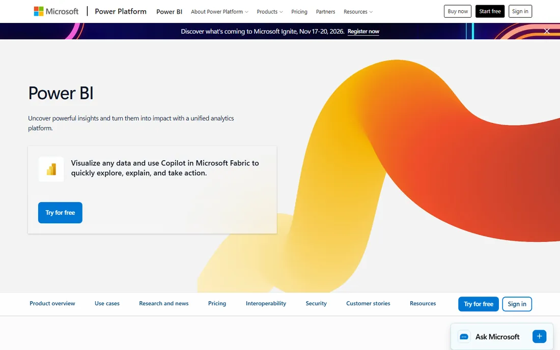
Power BI delivers a remarkable share of Tableau's capability at a fraction of the price, especially for companies already on Microsoft 365. Dashboards, data modeling with DAX, and AI visuals come standard, and distribution through Teams and SharePoint is smooth.
The value proposition is simple: per-user pricing that undercuts every serious competitor, bundled into ecosystems companies already pay for. For Microsoft shops, the total cost of BI drops dramatically.
The catch is the ecosystem lock. Sharing and collaboration require Pro or Premium licenses, and the experience is smoothest with Microsoft data sources. Organizations on Google or mixed stacks get less of the magic. But on value alone, Power BI is hard to argue against.
What we like- Unbeatable price for the capability
- Deep Microsoft 365 integration
- Strong DAX modeling
Watch out for- Sharing requires paid licenses
- Weaker on non-Microsoft stacks
Starting priceSee website
Free planFree trial
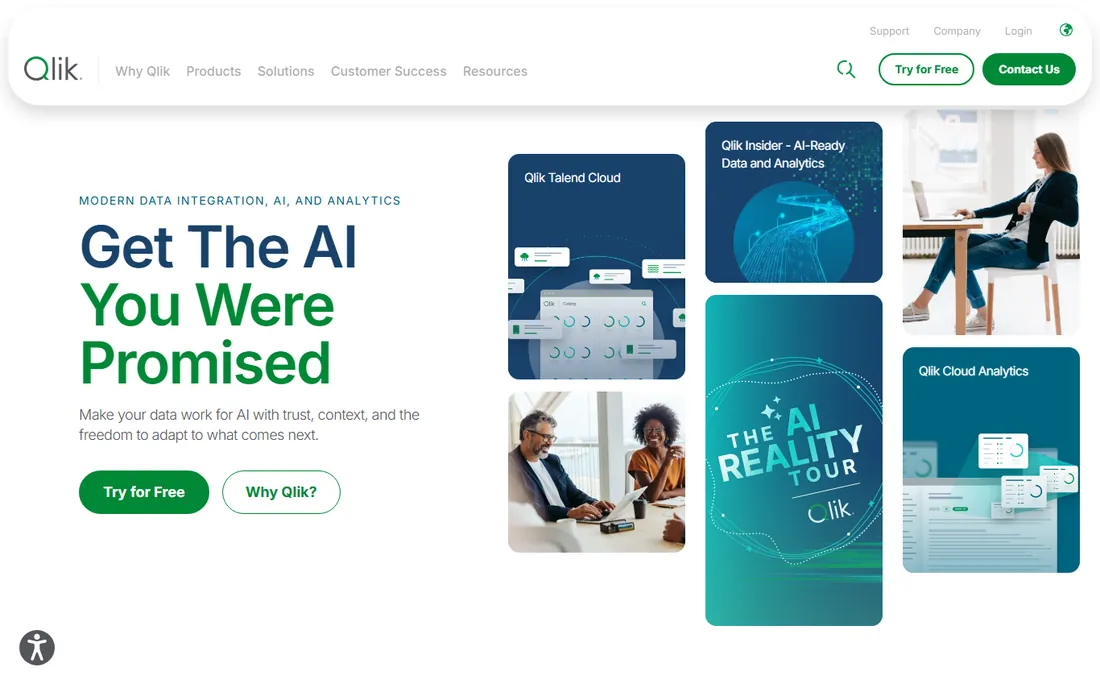
Qlik's associative engine is genuinely different: instead of query-based filtering, it shows how every selection relates to all your data, highlighting connected and excluded values. Analysts discover relationships that traditional BI misses.
At enterprise scale, Qlik performs well with large data volumes and complex models. The data integration capabilities, strengthened by acquisitions, help companies combine disparate sources. Augmented analytics features add machine learning assistance.
The learning curve exceeds Tableau's or Power BI's, and pricing targets enterprises. But for organizations doing deep, associative analysis on complex data, Qlik's engine offers something the others do not.
What we like- Associative engine reveals hidden connections
- Strong at scale
- Good data integration
Watch out for- Steeper learning curve
- Pricing is enterprise-oriented
Starting priceSee website
Free planNo
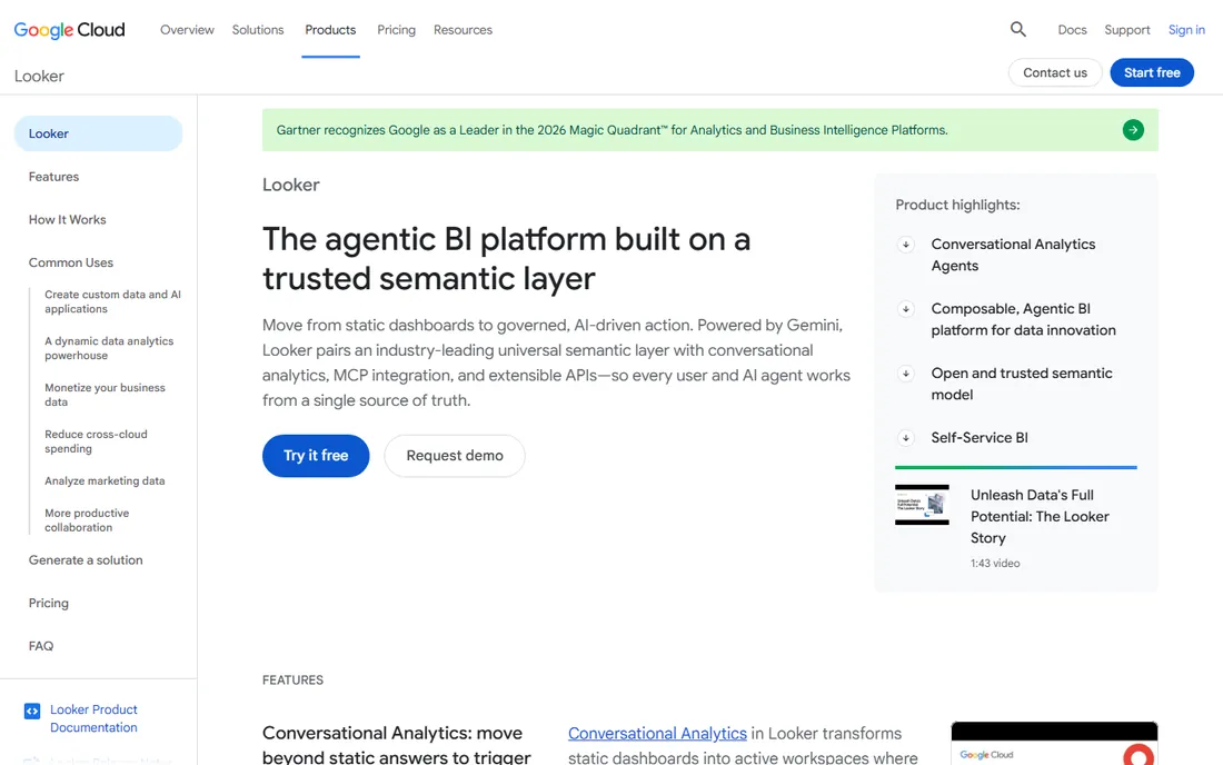
Looker, now part of Google Cloud, takes the governed approach: data teams define metrics once in LookML, and every dashboard and analysis uses the same definitions. The "single version of truth" problem that plagues self-service BI gets a real solution.
Version control on data models brings software engineering discipline to analytics. Changes are reviewed, tested, and deployed like code. For companies where conflicting numbers across departments cause real damage, that governance is worth the rigidity.
Analysts sacrifice some exploration freedom; everything flows through the modeled layer. LookML expertise is a specialized skill. But organizations that prioritize consistent, trusted metrics over ad-hoc exploration find Looker's discipline exactly right.
What we like- Centralized metrics layer
- Version-controlled data models
- Strong governance
Watch out for- Requires LookML expertise
- Less visual exploration freedom
Starting priceSee website
Free planFree trial
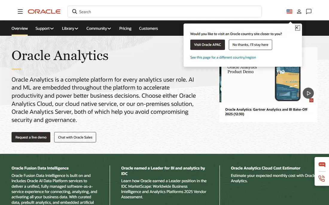
Oracle Analytics Cloud brings machine learning-assisted analysis to enterprises running on Oracle. Natural language queries, automated insights, and embedded analytics serve the Oracle-centric organization well.
The augmented analytics features genuinely help business users: the system suggests relevant visualizations, explains drivers behind metrics, and surfaces anomalies. For companies already invested in Oracle databases and applications, the integration depth is unmatched.
Outside the Oracle ecosystem, the value proposition weakens, and Oracle's licensing complexity is legendary. But for the large installed base of Oracle enterprises, the analytics platform that speaks natively to their data has obvious appeal.
What we like- Deep Oracle integration
- Strong augmented analytics
- Enterprise security
Watch out for- Best value inside Oracle ecosystem
- Complex licensing
Starting priceSee website
Free planFree trial
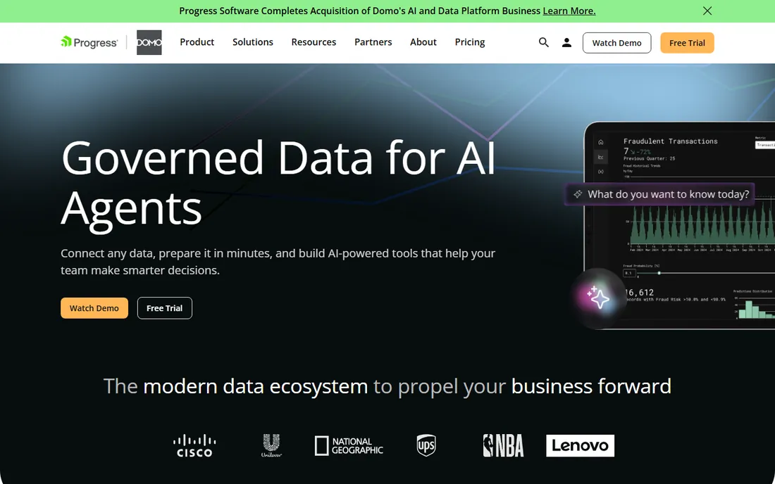
Domo promises BI that business users actually adopt, and its cloud-native design delivers fast time to value. Connect data sources, build dashboards with drag-and-drop, and share via a mobile experience that is genuinely good.
The platform targets the business user rather than the data team: alerts, annotations, and collaboration features fit how managers consume information. Appstore extensions add prebuilt solutions for common use cases.
Pricing has a reputation for surprising customers as usage grows, so model costs carefully. Hardcore analysts may find less depth than Tableau or Qlik. But for companies prioritizing adoption and speed over analytical depth, Domo's business-user focus works.
What we like- Fast time to value
- Business-user friendly
- Good mobile experience
Watch out for- Pricing can surprise
- Less depth for hardcore analysts
Starting priceSee website
Free planFree trial
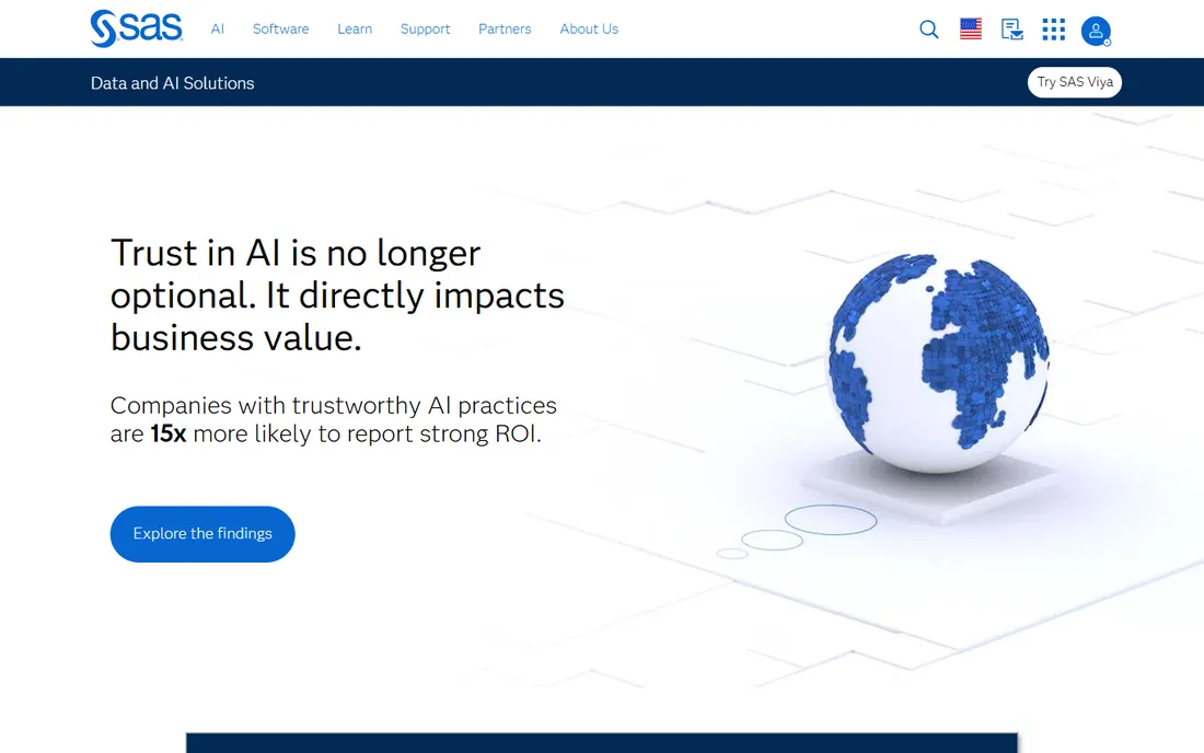
SAS is the heavyweight of advanced analytics: statistics, forecasting, optimization, and machine learning with a depth no BI tool matches. Banks, insurers, pharmaceutical companies, and governments trust it for decisions where being wrong costs millions.
Visual Analytics adds modern dashboards and self-service BI on top of the analytical engine, so business users get accessible reports powered by serious statistics underneath. The support organization has a legendary reputation.
It is expensive, and the learning curve is real; SAS programming is a specialized skill. But when the decision requires rigorous statistics rather than pretty charts, SAS remains the standard that regulated industries trust.
What we like- The deepest statistical toolkit
- Trusted in regulated industries
- Excellent support
Watch out for- Expensive
- Steeper learning curve
#8
IBM Cognos
Best for: enterprise reporting standard
Visit ibm.com
Starting priceSee website
Free planFree trial
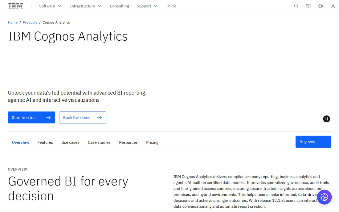
IBM Cognos Analytics has been the enterprise reporting standard for decades, and large organizations continue to rely on it for governed, pixel-perfect reporting. Financial statements, regulatory reports, and operational dashboards run on Cognos in thousands of enterprises.
The AI-assisted features modernize the experience: natural language queries and automated visualizations help business users without abandoning the governed foundation. Integration with the broader IBM data platform suits existing IBM customers.
It can feel less agile than Tableau or Power BI for exploratory analysis, and the interface shows its enterprise heritage. But for organizations where reporting must be controlled, auditable, and consistent, Cognos remains a safe, proven choice.
What we like- Proven enterprise reporting
- Strong governance
- IBM ecosystem integration
Watch out for- Dated feel in places
- Less agile than modern BI
Choosing between exploration and governance
The fundamental tension in decision support is exploration versus governance. Tableau and Power BI maximize analyst freedom to explore; Looker and Cognos maximize consistency and control. Most organizations need both, which is why the choice is rarely one tool.
A workable pattern: a governed semantic layer (Looker, or Power BI datasets) defines official metrics, while analysts explore freely in Tableau or Power BI against governed data. That gives consistency where it matters and freedom where it helps.
The failure mode is all freedom with no governance: ten dashboards with ten different revenue numbers, and executives who trust none of them. Whatever tools you choose, assign ownership of metric definitions.
The real cost is people, not licenses
BI software pricing gets the attention, but the real investment is the people: data engineers building pipelines, analysts building dashboards, and the organizational change of becoming data-driven. A cheap tool with no analysts produces nothing.
Budget for the team alongside the software. One good analytics engineer often delivers more value than upgrading every license tier. And invest in data literacy; the best dashboards fail when the audience cannot read them.
Start with one high-value use case, prove the ROI, and expand. The companies that succeed with decision support systems start narrow and grow, not the reverse.
Data quality: the unglamorous foundation
Every BI tool on this list is only as good as the data behind it. Duplicate customers, inconsistent product names, and missing values produce beautiful dashboards that mislead. Before expanding your BI footprint, invest in the boring work of data cleaning and standardization.
Assign data ownership explicitly. Every critical dataset needs someone responsible for its accuracy, with the authority to fix source systems. Without ownership, data quality decays and trust in every dashboard erodes with it.
Start every BI initiative with a data audit, not a tool demo. Know what you have, where it lives, and how reliable it is. The audit often reveals that the limiting factor is not the visualization tool but the pipeline feeding it.
Self-service without chaos
Self-service BI promises everyone their own answers, and delivers it, along with ten conflicting versions of revenue. The solution is not restricting access but governing the foundations: certified datasets, documented metric definitions, and clear labels distinguishing official numbers from exploratory analysis.
Create a simple certification program. Datasets reviewed and approved by the data team get a badge; everything else is clearly marked as uncertified. Users keep their freedom to explore, and decision-makers know which numbers to trust.
Train for interpretation, not just tool usage. The most expensive BI failures come from confident misreadings, not from broken charts. A little statistical literacy across the organization pays for itself many times over.
How we chose
We compared analytics and BI platforms that organizations use to support business decisions, based on vendor documentation, analyst research, and practitioner reviews on G2, Capterra, and TrustRadius. We covered visual exploration leaders, governed modeling platforms, cloud BI, and advanced analytics, spanning the needs of analysts, business users, and data teams. Pricing is typically quote-based, so we link to vendors for current numbers.
Frequently asked questions
What is a decision support system?
Software that helps people make decisions by turning data into analysis, forecasts, and visualizations. Modern DSS usually means BI platforms, analytics tools, and the data infrastructure behind them. The goal is better decisions, faster, backed by evidence.
Do we need a data warehouse first?
It helps enormously. BI tools perform best against clean, modeled data rather than raw operational systems. Cloud warehouses have made this affordable, but you can start with direct connections and add a warehouse as needs grow.
How do we get executives to actually use dashboards?
Build for their decisions, not for data completeness. One dashboard answering their top three questions beats ten comprehensive ones. Deliver insights proactively; executives rarely browse dashboards unprompted.
Build or buy for our analytics needs?
Buy the platform, build the content. BI platforms are commodities not worth rebuilding; your competitive advantage is in the metrics, models, and decisions unique to your business. Spend engineering time on data pipelines and analysis, not chart libraries.
How do we measure ROI on BI software?
Track decisions changed and time saved. Common measures: reporting time reduced, forecast accuracy improved, and specific decisions (pricing, inventory, hiring) made with data that were previously gut calls. The ROI is in better decisions, which requires actually deciding differently.
Sources we checked (8)
- https://www.tableau.com/
- https://www.microsoft.com/en-us/power-platform/products/power-bi/
- https://www.qlik.com/us
- https://cloud.google.com/looker
- https://www.oracle.com/analytics/
- https://www.domo.com/
- https://www.sas.com/en_us/home.geo.html
- https://www.ibm.com/products/cognos-analytics
Is your product missing or out of date?
We review this list regularly. Vendors can request a listing, send updated pricing or ask about featured placement.

Shihab Mia · Founder, Rankite
Shihab has spent more than a decade helping SaaS and e-commerce brands grow through search. He writes Rankite's software buying guides from pricing pages, documentation and public user reviews. More about Shihab.