How we make this list: we compare pricing pages, product documentation and public user reviews. Rankite is independent; if a vendor ever pays for a featured spot, that listing is clearly labeled Partner.
Key takeaways
- Monday.com and ClickUp lead on dashboard flexibility: Monday's widget system is the most polished, while ClickUp's is the most generous on its free plan.
- Asana and Smartsheet serve opposite needs: Asana for calm portfolio rollups, Smartsheet for dense operational control rooms.
- Airtable's Interface Designer builds live dashboards from your data with no code, while Notion trades analytical depth for beautiful team hubs.
- Wrike and Jira are specialists: Wrike for delivery PMOs managing portfolios, Jira for agile engineering teams tracking sprints.
- Dashboard power concentrates on paid tiers, so expect roughly $9 to $20 per user per month for the plans where reporting gets serious.
Quick comparison
| Tool | Best for | Starting price | Free plan |
|---|
 Monday.com Monday.com | most polished customizable dashboards | $9 per seat/month (Basic, billed annually, 3-seat minimum) | Yes |
 ClickUp ClickUp | generous dashboards on the free plan | Free; Unlimited from $7 per user/month (billed annually) | Yes |
 Asana Asana | calm portfolio rollups for leadership | $10.99 per user/month (Starter, billed annually) | Yes |
 Smartsheet Smartsheet | dense operational control rooms | $9 per member/month (Pro, billed annually) | Free trial |
 Airtable Airtable | no-code dashboards on live databases | Free; Team from $20 per seat/month (billed annually) | Yes |
 Wrike Wrike | portfolio oversight for delivery teams | See website | Yes |
 Notion Notion | beautiful team hubs and narrative reporting | Free; Plus from $10 per member/month (billed annually) | Yes |
 Jira Jira | agile reporting for engineering teams | See website | Yes |
Is your product missing or out of date?
We review this list regularly. Vendors can request a listing, send updated pricing or ask about featured placement.
Starting price$9 per seat/month (Basic, billed annually, 3-seat minimum)
Free planYes

Monday.com wins this ranking because its dashboards behave like a product of their own, not an afterthought. You pull widgets from any board, filter by person or status, and combine project data with workload views on a single screen. For a manager who lives in status meetings, that flexibility is the whole game: one dashboard can serve the daily standup and the quarterly review.
Pricing starts at $9 per seat per month billed annually on Basic, with a three-seat minimum, and dashboards grow more capable on Standard and Pro. The honest catch is sprawl. Build too many views and nobody remembers which one is current, so pick one canonical dashboard per team and retire the rest.
What we like- Widget-based dashboards pull from any board
- Workload and timeline views combine on one screen
- Dashboard sharing works well for stakeholders
Watch out for- Widget sprawl without governance
- Serious reporting features sit on higher tiers
Starting priceFree; Unlimited from $7 per user/month (billed annually)
Free planYes
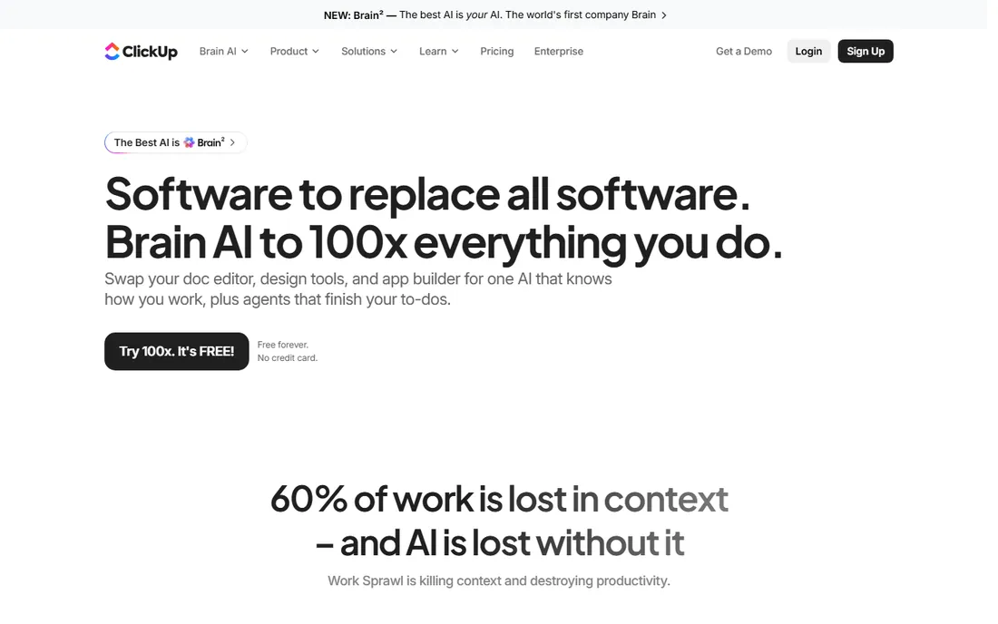
ClickUp's dashboards are the most generous at the free level, which is why small teams adopt it fast. Custom widgets pull from tasks, docs, and time tracking, so one screen can show sprint progress next to workload next to goals. It is the everything-app approach, applied to reporting, and for teams that want one tool for everything, the dashboard reflects that.
Unlimited starts at $7 per user per month billed annually, and the free plan covers the basics well. The tradeoff is complexity. ClickUp exposes so many options that new admins spend real time learning which widgets do what, and a disorganized workspace will surface as a disorganized dashboard.
What we like- Custom widgets cover tasks, docs, time, and goals
- Free plan includes real dashboard functionality
- Cards can be shared with guests
Watch out for- Overwhelming number of options for new admins
- Messy workspaces produce messy dashboards
Starting price$10.99 per user/month (Starter, billed annually)
Free planYes

Asana's dashboards feel calm, which is a compliment. Project dashboards roll up tasks by status, assignee, and custom fields, and portfolios extend that view across projects for leadership. If your team already runs on Asana, the reporting layer asks almost nothing new of them, and that low friction is why adoption sticks.
Starter costs $10.99 per user per month billed annually, with a free Personal plan for up to two users. Deeper portfolio analytics sit on the Advanced tier at $24.99, so growing teams should price the tier they will actually need rather than the one they start on.
What we like- Project dashboards roll up tasks by status and assignee
- Portfolios extend reporting across projects
- Clean design executives actually read
Watch out for- Advanced analytics sit on the pricey Advanced tier
- Less widget-level customization than Monday.com
Starting price$9 per member/month (Pro, billed annually)
Free planFree trial
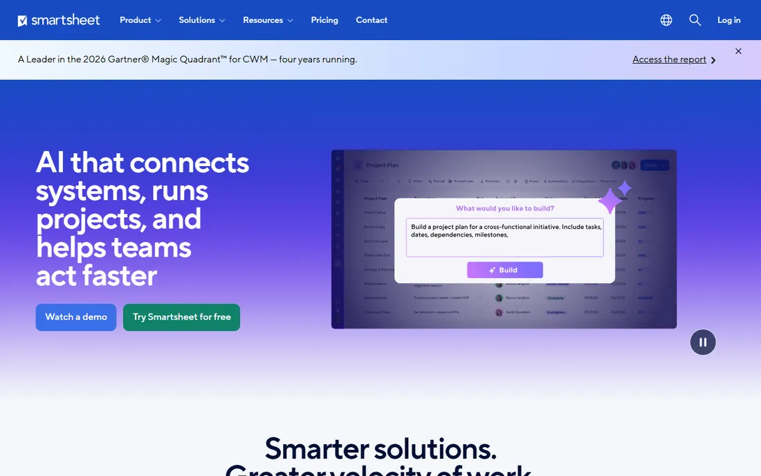
Smartsheet dashboards look like the control rooms of the operations world, because that is who buys them. You assemble charts, metrics, and sheet reports into portal-style pages, with Gantt and card views feeding the same numbers underneath. For program managers tracking dozens of workstreams, that density is the point: everything visible, nothing decorative.
Pro starts at $9 per member per month billed annually, with a 30-day trial and no free plan. Smartsheet rewards spreadsheet thinkers and tests everyone else. The learning curve is real, and casual users will need training before they build anything useful.
What we like- Portal-style dashboards assemble charts and metrics from sheets
- Gantt and card views feed the same data
- Strong for program-level tracking
Watch out for- No free plan, only a 30-day trial
- Real learning curve for casual users
Starting priceFree; Team from $20 per seat/month (billed annually)
Free planYes
Airtable's Interface Designer turns a database into a dashboard without code, which is its real trick. You design pages with charts, record lists, and filters that read live from your bases, so the dashboard never goes stale the way an exported report does. Teams that already model their work in Airtable get executive views almost for free.
The free plan is usable for small setups, and Team starts at $20 per seat per month billed annually. The limit is scale: very large bases and heavy dashboard usage push you toward higher tiers, and Airtable remains a database first, so complex project workflows need creative workarounds.
What we like- Interface Designer builds dashboards without code
- Views read live from bases so nothing goes stale
- Filters and charts are easy to configure
Watch out for- Costs climb with large bases and heavy use
- Project workflows need workarounds
Starting priceSee website
Free planYes
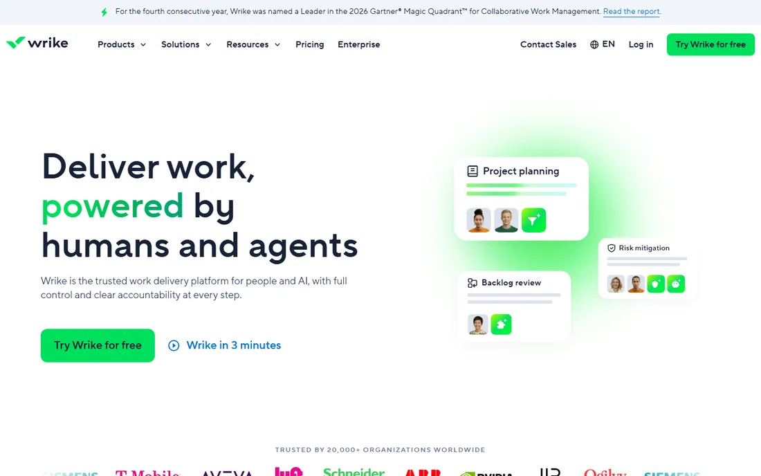
Wrike aims its dashboards at delivery leaders who manage portfolios, not just tasks. Cross-project dashboards, intake request forms, and resource views give PMOs oversight without exporting to spreadsheets. The analytics lean enterprise, with AI-assisted reporting on higher tiers, and the whole system assumes structured delivery work.
Wrike does not publish pricing we could verify on its own site, so expect a quote, though a free plan exists for small teams. The product's strength is also its barrier: it is built for organized delivery organizations, and lighter teams may find the setup heavier than they need.
What we like- Cross-project dashboards for portfolio views
- Request forms feed intake directly
- Resource management views for capacity planning
Watch out for- Pricing not published on the vendor site
- Heavier setup than lighter tools
#7
Notion
Best for: beautiful team hubs and narrative reporting
Visit notion.so
Starting priceFree; Plus from $10 per member/month (billed annually)
Free planYes
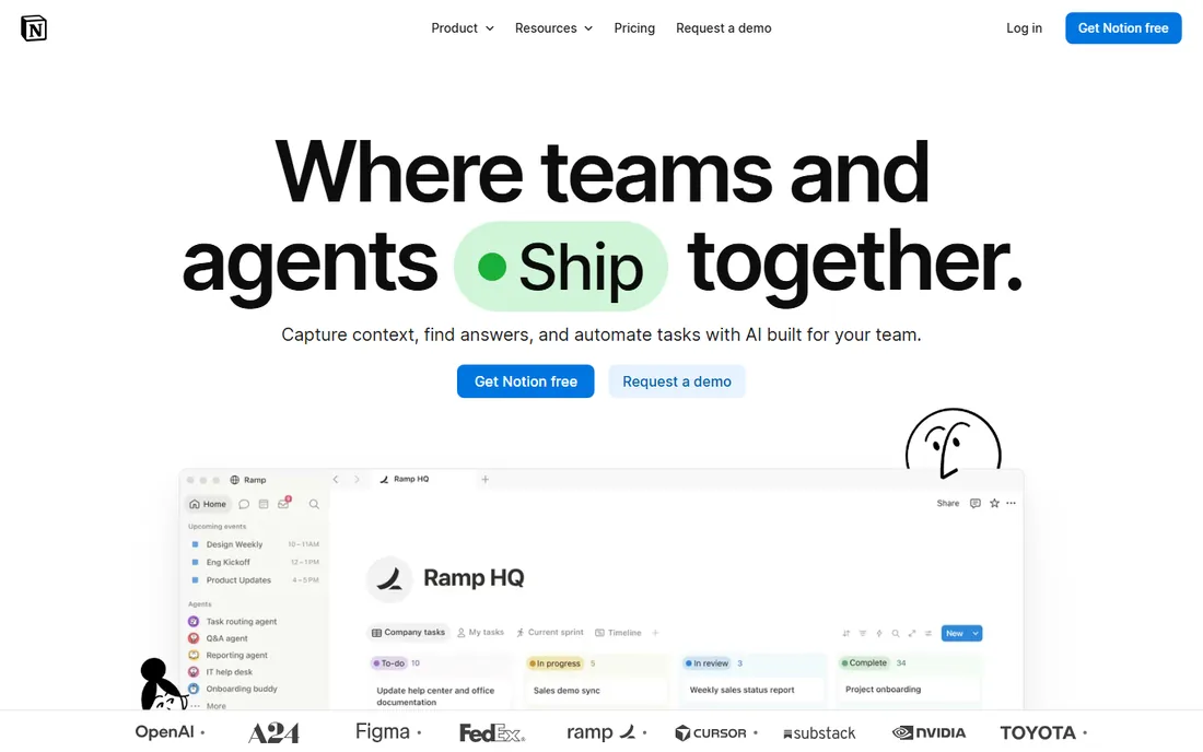
Notion dashboards are the prettiest on this list and the least analytical. You build them from linked databases, gallery views, and embedded charts, which makes them wonderful for team hubs and project wikis where context matters as much as numbers. For narrative reporting, the kind where a chart sits inside a written update, Notion shines.
The free plan is generous, and Plus starts at $10 per member per month billed annually. But Notion is not a reporting engine: cross-database rollup analytics do not compare with the BI-style dashboards above, so number-heavy teams will feel the ceiling quickly.
What we like- Dashboards double as gorgeous team wikis
- Linked databases keep views consistent
- Generous free plan for small teams
Watch out for- No real BI-style analytics engine
- Weak at number-heavy rollup reporting
Starting priceSee website
Free planYes
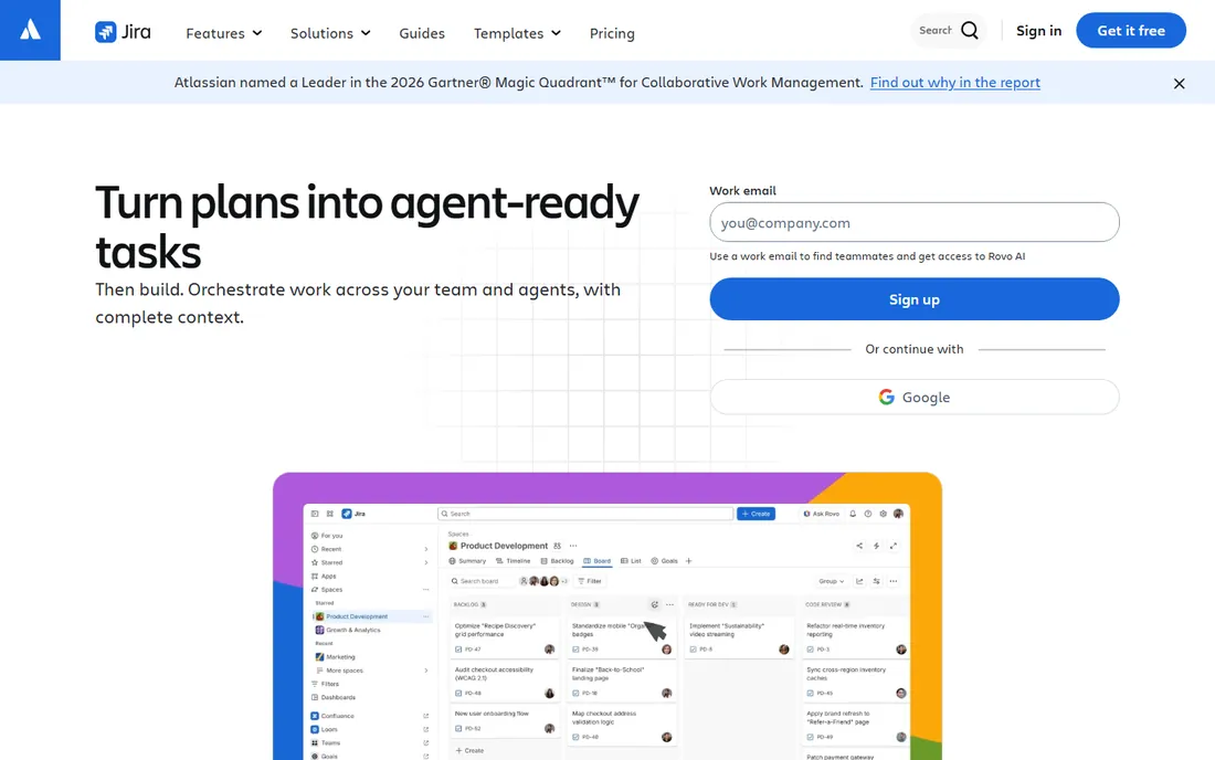
Jira dashboards are utilitarian, built for engineering teams that live in sprints. Burndown charts, velocity reports, and gadget-based dashboards track agile delivery precisely, and the data is trustworthy because it comes straight from the workflow rather than a manual update. For software teams, nothing else on this list speaks their language.
Pricing is not published in a form we could verify on the vendor site, so check Atlassian's current tiers; a free plan covers up to ten users. The catch is audience: outside engineering, Jira dashboards feel cryptic, and non-technical stakeholders usually need someone to translate.
What we like- Burndown, velocity, and sprint reports built in
- Gadget dashboards track agile delivery precisely
- Data comes straight from the workflow
Watch out for- Pricing not published in verifiable form
- Cryptic for non-technical stakeholders
How to judge a dashboard before you commit
Live data or screenshots
A dashboard that refreshes from live project data stays trustworthy. One that depends on manual updates or exports goes stale within a week. During a trial, change a task status and watch how fast the dashboard reflects it. If it takes a sync or a refresh ritual, factor that into your workflow.
Who builds the views
Some tools expect an admin to design every dashboard; others let any team member drag widgets together. Admin-built dashboards stay consistent but create a bottleneck. Self-serve dashboards spread faster but drift into chaos. Decide which failure mode your company tolerates better, then pick accordingly.
Drill-down depth
A good dashboard answers the follow-up question, not just the first one. Click a red status and you should land on the blocked tasks, not on a static chart. Test this in every trial: the tools that let you drill from portfolio to project to task will save hours in real meetings.
Where dashboards fall short
Dashboards show the state of work, not the quality of it. A project can be green on every widget and still headed for trouble if the underlying estimates were fiction. Treat dashboards as a starting point for conversation, not as proof. The teams that get the most from these tools pair the dashboard with a weekly review where someone asks what the colors are hiding.
How we chose
We evaluated each tool's dashboard and reporting features from vendor documentation, pricing pages, and public reviews on sites like G2 and Capterra, then ranked them specifically on dashboard power rather than overall project management strength. Prices come from the vendors' own published pages; where pricing was not published, we wrote See website. We did not run hands-on trials, so this ranking reflects documented capability and reviewer consensus, not lab testing.
Frequently asked questions
What makes a good dashboard in work management software?
Three things: live data that refreshes on its own, views tailored to each audience, and drill-down from summary to detail. A dashboard that only shows what you already know, or that needs manual updating, will be abandoned within a month.
Do I need a paid plan for dashboards?
For anything beyond basics, usually yes. Free plans in this roundup include limited dashboards, but cross-project rollups, portfolios, and advanced widgets sit on paid tiers starting around $9 to $11 per user per month. Trial the paid reporting features before you commit, since they drive much of the value.
Which tool has the best free dashboard features?
ClickUp's free plan includes the most capable dashboards at zero cost, followed by Notion for team hubs. If your team is small and your reporting needs are simple, either can carry you for a long time before an upgrade makes sense.
Can I share dashboards with people outside my team?
Most of these tools support sharing, but the details vary. Monday.com and ClickUp handle stakeholder sharing well, while Smartsheet's portal-style pages suit external viewers. Check guest and viewer permissions on your plan, since some vendors charge for external viewers.
How do dashboards differ from reports?
A dashboard is a live view you check repeatedly; a report is a snapshot you send or file. Dashboards answer "what is happening now," while reports answer "what happened last quarter." The best tools on this list do both, but they are built around the dashboard first.
Sources we checked (11)
- https://monday.com
- https://asana.com
- https://theplainmanual.com/trello-vs-asana/
- https://clickup.com/
- https://max-productive.ai/blog/clickup-free-plan/
- https://www.wrike.com
- https://www.smartsheet.com
- https://www.ganttile.com/alternatives/smartsheet-alternatives
- https://notion.so/
- https://www.airtable.com
- https://www.atlassian.com/software/jira
Is your product missing or out of date?
We review this list regularly. Vendors can request a listing, send updated pricing or ask about featured placement.

Shihab Mia · Founder, Rankite
Shihab has spent more than a decade helping SaaS and e-commerce brands grow through search. He writes Rankite's software buying guides from pricing pages, documentation and public user reviews. More about Shihab.