How we make this list: we compare pricing pages, product documentation and public user reviews. Rankite is independent; if a vendor ever pays for a featured spot, that listing is clearly labeled Partner.
Key takeaways
- Lucidchart ($7.95/user/month) is the best for flowcharts, diagrams and technical charts.
- Canva ($120/year Pro) is the easiest way to make beautiful charts for presentations and social.
- diagrams.net is completely free and surprisingly capable for technical diagrams.
- Datawrapper and Flourish (free tiers) are the journalists' choice for data-driven charts and interactives.
- Miro ($8/user/month) suits teams charting ideas together on a whiteboard.
Quick comparison
| Tool | Best for | Starting price | Free plan |
|---|
 Lucidchart Lucidchart | Flowcharts and diagrams | $7.95 per user/month (Individual) | Yes |
 Canva Canva | Beautiful presentation charts | $120 per year (Pro) | Yes |
 diagrams.net diagrams.net | Free technical diagrams | Free | Yes |
 Datawrapper Datawrapper | Data journalism charts | Free | Yes |
 Flourish Flourish | Interactive data stories | Free | Yes |
 Miro Miro | Collaborative charting | $8 per user/month | Yes |
 Visme Visme | Infographics and charts | See website | Yes |
 Venngage Venngage | Infographic-style charts | See website | Yes |
Is your product missing or out of date?
We review this list regularly. Vendors can request a listing, send updated pricing or ask about featured placement.
Two kinds of charts
Chart making splits into diagrams, flowcharts, org charts, mind maps (Lucidchart, diagrams.net, Miro), and data charts, bar, line, pie and interactive visualizations (Datawrapper, Flourish, Canva, Visme, Venngage). Know which you need; the tools barely overlap.
Starting price$7.95 per user/month (Individual)
Free planYes
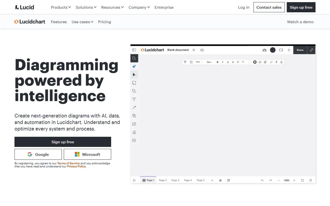
Lucidchart is the standard for professional diagrams: flowcharts, org charts, network diagrams, ERDs and process maps, with intelligent shape libraries, real-time collaboration and integrations into Google Workspace and Microsoft. Setup is quick: sign up, pick a template, and the drag-and-drop editor feels familiar within minutes. Shape libraries are intelligent, snapping connectors and suggesting layouts as you work. Real-time collaboration lets teams edit together with comments and version history, and integrations into Google Workspace, Microsoft 365, Slack and Atlassian tools embed diagrams where work happens. Admin controls include SSO and user management on team plans. Individual plans start at $7.95 a user a month.
The free plan caps you at a handful of editable documents, which is enough to test but not to work. Support is solid, with a deep help center and responsive chat. For data-driven charts it is basic. When the chart explains a process or system rather than numbers, Lucidchart is the professional choice.
What we like- Best diagramming toolkit
- Huge shape libraries
- Real-time collaboration
- Integrations
Watch out for- Data visualization is basic
- Free plan is limited
Starting price$120 per year (Pro)
Free planYes
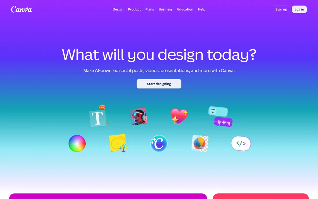
Canva makes charts beautiful with zero design skill: pick a template, paste your data, and get a presentation-ready chart in minutes. The chart editor connects to the full design suite, so your chart sits inside branded slides, docs and social graphics without exporting. Pro at $120 a year adds brand kits and premium elements, but the free tier covers chart basics. Collaboration is simple: share a link, comment, and publish together in real time.
Large datasets and complex calculations belong elsewhere; there is no pivot-table equivalent and live data connections are limited. Support runs through the help center and chat, with the community forum filling gaps. Data handling is shallow compared with dedicated tools. For slides, reports and social graphics where looks matter, Canva is the fastest path.
What we like- Gorgeous templates
- Easiest to learn
- Charts plus full design suite
Watch out for- Data features are shallow
- Serious analysts need more
Starting priceFree
Free planYes
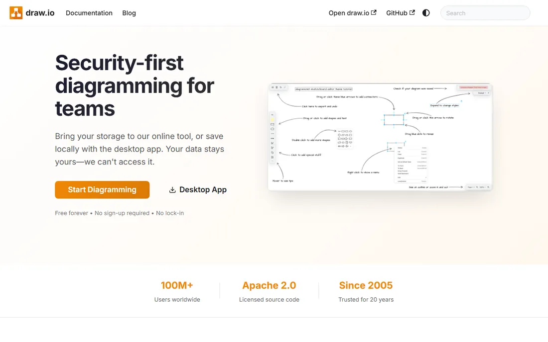
diagrams.net, formerly draw.io, is the free diagramming powerhouse: flowcharts, network diagrams, UML and more, saved to your own Google Drive or device, with no account and no cost. Setup is nothing: open the site and start drawing, with files saved to Google Drive, OneDrive, Dropbox or your own device. The shape libraries cover everything from AWS architecture icons to electrical engineering symbols. Because your files live in your own storage, there is no vendor lock-in and no data leaving your control. Confluence and Jira integrations make it an enterprise staple.
Support is community-driven through GitHub and forums, which suits technical users but can frustrate beginners. The interface is dense; expect an hour of orientation before it feels natural. The design is functional rather than beautiful, and it does not do data charts. For free technical diagramming, nothing else comes close.
What we like- Completely free
- Powerful diagramming
- Integrates with Google Drive and Confluence
Watch out for- Utilitarian design
- No data chart focus
Starting priceFree
Free planYes
Datawrapper is how newsrooms make charts: paste data, get a clean, responsive, publication-ready chart or map in minutes. Setup takes minutes: paste a spreadsheet, pick a chart type, and the defaults handle colors, labels and responsive sizing. Maps are a standout, with locator maps and choropleths that embed cleanly in articles. The team features on paid plans add shared folders, custom themes and branding controls. The free tier covers most needs, and the output looks professionally designed by default.
Support is email-based and knowledgeable, with thorough documentation and a blog full of chart-design guidance. Export options include PNG, SVG and PDF on paid tiers. Deep customization requires paid plans. For data-driven charts that need to look right and embed anywhere, journalists' trust is well earned.
What we like- Publication-quality charts in minutes
- Free tier is generous
- Trusted by newsrooms
Watch out for- Design customization has limits
- Advanced features are paid
Starting priceFree
Free planYes
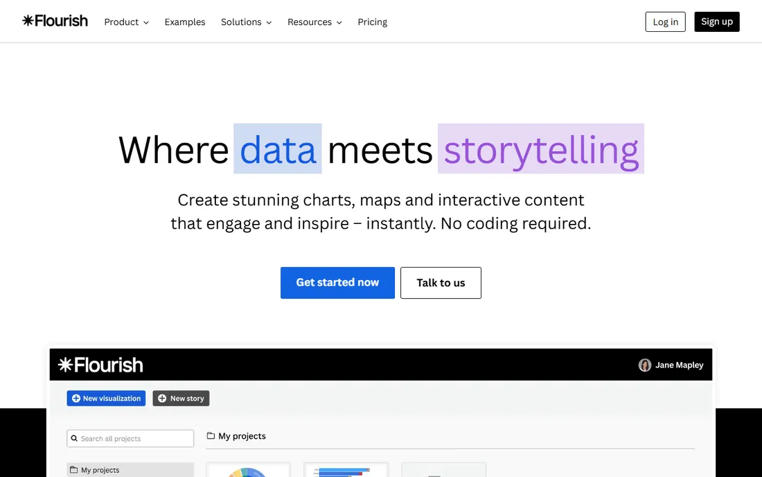
Flourish creates the animated, interactive data visualizations you see in top publications: bar chart races, interactive maps, scrollytelling graphics, all without code. The template gallery is the product: dozens of visualization types, each with a guided setup that walks you through binding your data. Stories combine multiple visualizations into scrollable narratives. Publishing is instant, with an embed code or a hosted link for every project. The free tier produces genuinely impressive output.
Paid plans remove branding, add private projects, custom fonts and more export control. Support is decent, with documentation and a responsive team behind the templates. Free embeds carry Flourish branding. For data stories that engage readers rather than just inform them, Flourish is the most exciting tool here.
What we like- Stunning interactive visualizations
- No coding needed
- Free tier is usable
Watch out for- Flourish branding on free embeds
- Advanced features paid
Starting price$8 per user/month
Free planYes

Miro's infinite canvas hosts collaborative diagramming: teams build flowcharts, org charts and concept maps together in real time, with templates for every framework. Setup is inviting teammates to a board and starting from a template; the learning curve is gentle. The template library covers retrospectives, user story mapping, mind maps and dozens of frameworks. Integrations with Jira, Asana, Slack and Google Workspace keep boards connected to project work. Enterprise plans add SSO, advanced admin and data controls. Starter is $8 a user a month.
Boards can grow unwieldy without a facilitator keeping things tidy. Support is good, with live chat and extensive academy courses. Per-user pricing adds up fast for large teams, so negotiate at scale. It visualizes ideas, not datasets. For workshops and team sessions where the chart emerges from discussion, the collaborative canvas is ideal.
What we like- Teams chart together live
- Endless templates
- Diagrams plus whiteboarding
Watch out for- Not a data visualization tool
- Per-user pricing adds up
Starting priceSee website
Free planYes

Visme combines charts with full infographic and presentation design: data widgets inside designed layouts, with interactivity and animation options. The editor feels like a lighter design suite: drag-and-drop layouts, a stock asset library, and data widgets that bind to your numbers. Templates cover reports, presentations, infographics and social graphics. Collaboration tools let teams share brand assets and comment on drafts. The free tier lets you build real projects.
Pricing details sit behind the site, so request a quote before budgeting. Paid tiers add premium templates, more storage, and analytics on published projects. Support includes a help center and chat, with onboarding resources for teams. For one-person content teams making infographics, reports and charts in a single tool, consolidating everything in one place saves subscriptions.
What we like- Charts inside full infographic designs
- Templates
- Interactivity options
Watch out for- Pricing not transparent
- Learning curve for advanced features
Starting priceSee website
Free planYes
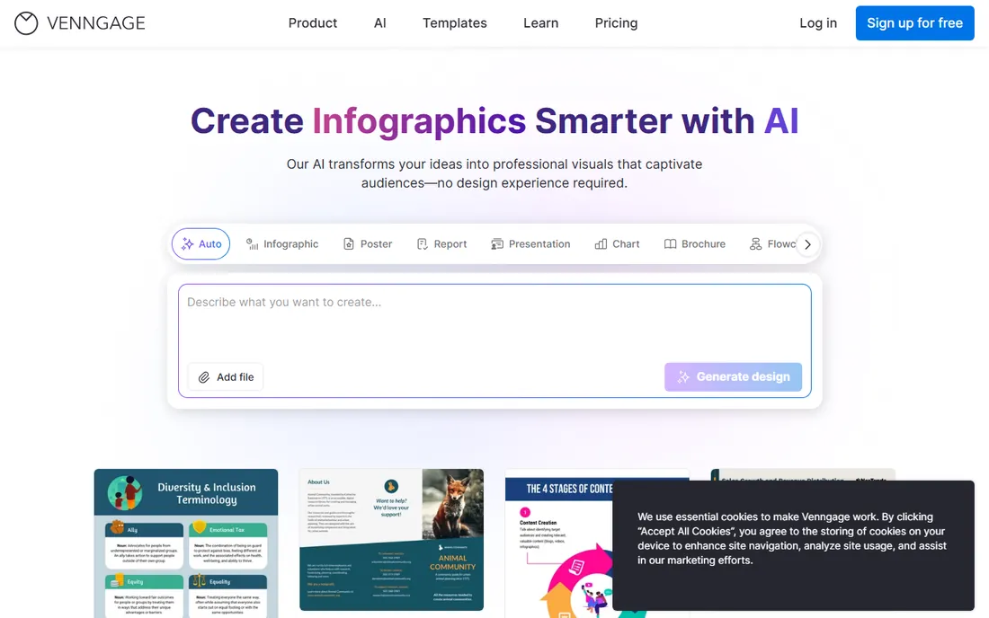
Venngage specializes in infographic-style charts: templates that turn data into designed graphics for reports, posters and social. The template library is organized by use case: business reports, marketing, education and nonprofits each get tailored starting points. Brand kits store your colors, fonts and logos so every graphic stays on-brand. Real-time collaboration lets teams co-edit, and the My Brand feature keeps client work separated. Non-designers get professional-looking output fast.
Paid plans raise export limits, add high-resolution downloads and remove watermarks. Support is email-based with a solid help center. Data import stays basic even on paid tiers: expect to paste or type numbers rather than connecting live sources. The free plan limits exports and data import is basic. For communications teams producing designed data graphics regularly, the template library is the draw.
What we like- Infographic-first chart templates
- Easy branding
- Good for non-designers
Watch out for- Free plan is limited
- Data import is basic
Pick by output, not by habit
Explaining a process: Lucidchart or diagrams.net. Presenting numbers beautifully: Canva, Visme or Venngage. Publishing data online: Datawrapper or Flourish. Brainstorming visually with a team: Miro. The chart's job determines the tool.
Budget changes the answer: diagrams.net and Datawrapper's free tiers cover serious work at zero cost. Teams already paying for Canva or Miro should check whether those tools cover the need before adding another subscription. And if the chart updates regularly, favor tools with live data connections over ones that need manual repasting.
How we chose
We compared the most used chart making tools in 2026, verifying pricing against vendor pages. We weighted chart quality, ease of use, template libraries and value for both diagram and data-chart needs. We did not produce test charts in each tool.
Frequently asked questions
What is the best free chart making software?
diagrams.net for diagrams, Datawrapper's free tier for data charts, and Canva's free tier for presentation charts. Between them, most chart needs are covered at zero cost. All three export standard formats, so you can start free and move to a paid tool later without losing work. For teams, check whether your existing stack already includes charting before adding a new tool.
Canva vs Lucidchart: which for charts?
Canva for beautiful data charts in presentations and graphics. Lucidchart for flowcharts, org charts and technical diagrams. They solve different problems. Many teams end up using both: Lucidchart for the process documentation, Canva for the slide deck that presents it. If you must pick one, pick the one matching the output you produce most.
How do I make interactive charts for a website?
Flourish and Datawrapper both produce embeddable interactive charts without coding. Flourish leans toward animation and storytelling; Datawrapper toward clean newsroom graphics. Both offer responsive embeds that adapt to mobile screens. Test the embed on your actual site before publishing, since CMS themes can clash with iframe styling.
What is the difference between a chart and an infographic?
A chart visualizes data; an infographic combines charts, text and design into a narrative graphic. Tools like Visme and Venngage build infographics around charts.
Do I need to know design to make good charts?
No: Datawrapper, Flourish and Canva produce professional output from templates. Good chart design is mostly about choosing the right chart type and removing clutter. Start with the default styling and change as little as possible; the templates were designed by people who do this for a living. The most common beginner mistake is adding decoration that obscures the data.
Sources we checked (8)
- https://www.lucidchart.com/
- https://www.canva.com/
- https://www.diagrams.net/
- https://www.datawrapper.de/
- https://www.flourish.studio/
- https://www.miro.com/
- https://www.visme.com/
- https://www.venngage.com/
Is your product missing or out of date?
We review this list regularly. Vendors can request a listing, send updated pricing or ask about featured placement.

Shihab Mia · Founder, Rankite
Shihab has spent more than a decade helping SaaS and e-commerce brands grow through search. He writes Rankite's software buying guides from pricing pages, documentation and public user reviews. More about Shihab.