How we make this list: we compare pricing pages, product documentation and public user reviews. Ratings come from G2, Capterra or Trustpilot, with the date we checked them.
Key takeaways
- Helvetica is a commercial font with a paid license, so free projects and websites need a substitute with similar proportions.
- Inter is the best all-around free replacement for screens, with a large x-height and excellent legibility at small sizes.
- Roboto and Open Sans are the safest choices for broad compatibility, since they ship on Android devices and across Google products.
- Liberation Sans and Arimo are metric-compatible with Arial, which makes them ideal when a document must keep the same layout after a font swap.
- All eight fonts on this list are free under open licenses, so you can use them in commercial work without buying a license.
Quick comparison
| Tool | Best for | Starting price | Free plan |
|---|
 Inter | Screen interfaces and apps | Free | Yes |
 Roboto | Android and Material Design | Free | Yes |
 Open Sans | Websites and long-form text | Free | Yes |
 Liberation Sans | Arial-metric document swaps | Free | Yes |
 Arimo | Arial-metric web use | Free | Yes |
 IBM Plex Sans | Corporate and editorial design | Free | Yes |
 Source Sans 3 | User interfaces and Adobe workflows | Free | Yes |
 Fira Sans | Code-adjacent and Mozilla-style projects | Free | Yes |
Is your product missing or out of date?
We review this list regularly. Vendors can request a listing, send updated pricing or ask about featured placement.
The best Helvetica alternatives
Starting priceFree
Free planYes
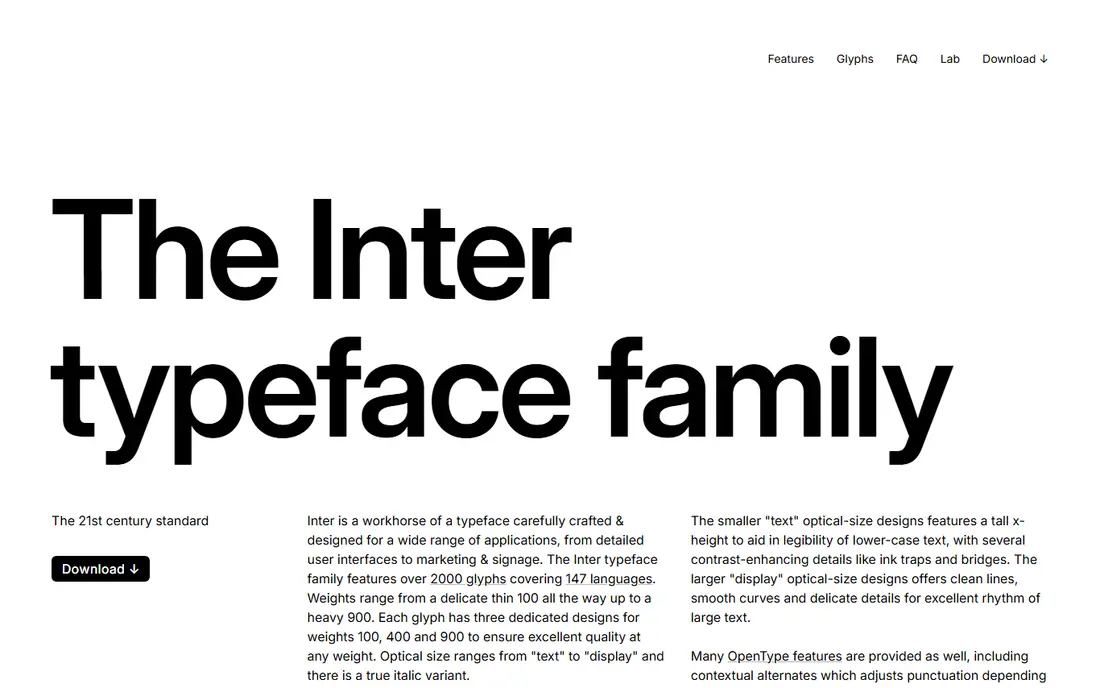
Inter is the first font most designers name when Helvetica is off the table, and its homepage shows why: it renders its own sample text in Inter, and the tall x-height and open apertures read clearly even in long paragraphs. It was designed for user interfaces, with features such as tabular numbers and careful spacing at small sizes that Helvetica never optimized for.
The trade-off is familiarity. Inter is everywhere in software now, so a brand built on it can feel anonymous. If distinctiveness matters more than legibility, pair it with a more characterful display font for headings rather than using it alone.
What we like- Designed specifically for computer screens
- Large x-height aids small-size reading
- Variable font with many weights
Watch out for- Very widely used, so designs can look generic
- No serif companion in the same family
Starting priceFree
Free planYes
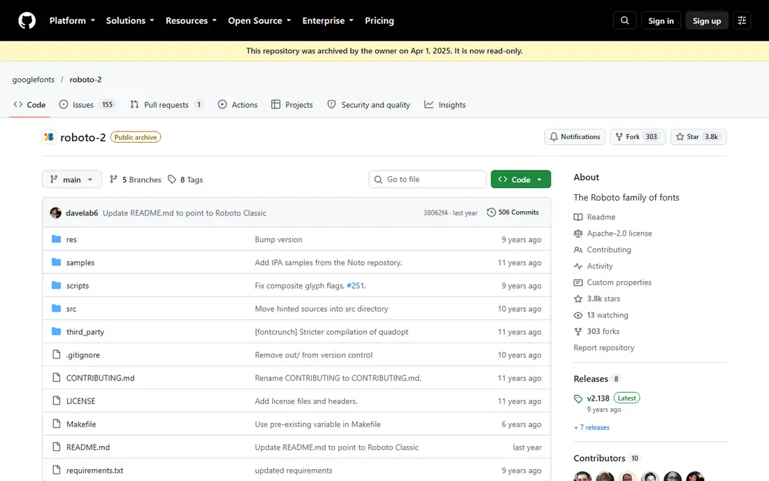
Roboto is Google's signature family, the default font on Android and Chrome OS, and the recommended font for Material Design. Its repository notes eighteen styles and support for Latin, Cyrillic, and Greek scripts. Compared with Helvetica, Roboto feels warmer: its curves are more open and its shapes slightly more humanist, which suits consumer products.
Note the repository status. The classic Roboto source repo is archived, and the project continues in a successor repository, so grab current files from Google Fonts rather than the archived source. Layouts also shift a little versus Helvetica, since Roboto runs slightly wider, so check line breaks after swapping.
What we like- Google's signature family and the default on Android
- Friendly curves soften the grotesque style
- Broad language coverage
Watch out for- Source repository is archived, with the project continuing elsewhere
- Slightly wider and rounder than Helvetica, so layouts shift
Starting priceFree
Free planYes
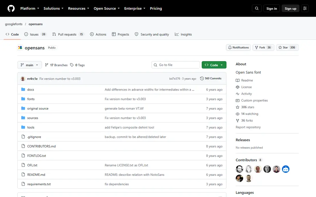
Open Sans was originally designed by Steve Matteson and remains one of the most used fonts on the web. Its repository describes it as a variable font, and its open shapes and generous spacing make long articles comfortable to read. For body text on a website, it is one of the safest Helvetica substitutes available.
The honest catch is character. Open Sans is deliberately neutral, which is a strength for readability and a weakness for brand identity. It also shares a close relationship with Noto Sans in its current sources, so designers chasing a specific older cut should check the version they install.
What we like- Designed by Steve Matteson with excellent on-screen readability
- Variable font version available
- Huge adoption across the web
Watch out for- Feels neutral to a fault
- Newer versions derive from Noto Sans sources, which changes some details
Starting priceFree
Free planYes
Liberation Sans exists for a practical job: its stated aim is metric compatibility with Arial, Times New Roman, and Courier New. That means a document set in Arial keeps the same line breaks and page count when Liberation Sans replaces it, which matters for templates, forms, and office documents. It is licensed under the SIL Open Font License and ships with many Linux systems.
Be clear about what it is not. It matches Arial's metrics, and Arial itself is a Helvetica-influenced design, but the letterforms are not identical to Helvetica. For layout preservation it is excellent. For a pixel-level Helvetica look, Inter or Roboto will feel closer.
What we like- Metric-compatible with Arial, so documents keep their layout
- SIL Open Font License
- Ships with many Linux distributions
Watch out for- Designed as an Arial stand-in, not a Helvetica clone, so letterforms differ on close inspection
- Limited weights compared with Inter
Starting priceFree
Free planYes
Arimo was designed by Steve Matteson as a sans serif metrically compatible with Arial, offering improved on-screen readability and a pan-European character set. Its purpose is document portability: a file that uses Arial on one machine keeps its layout when Arimo stands in on another. That makes it a strong pick for web apps and documents that must travel across platforms.
Like Liberation Sans, Arimo solves a layout problem rather than a style problem. Its range of weights and styles is narrower than the big interface fonts, and at large display sizes it can feel plain. Use it where compatibility matters most and save display work for a second font.
What we like- Metric-compatible with Arial for document portability
- Designed by Steve Matteson for on-screen readability
- SIL Open Font License
Watch out for- Narrower design range than Inter or Roboto
- Less distinctive at display sizes
#6
IBM Plex Sans
Best for: Corporate and editorial design
Visit ibm.com
Starting priceFree
Free planYes
IBM Plex Sans is the most distinctive font on this list, and that is a feature, not an accident. Its design borrows details such as a slab-serif influence and angular interior counters, giving it a technical, engineered feel that suits corporate and editorial work. It comes with mono and serif companions, so a whole typographic system can share one family.
That character is also the warning. Plex Sans does not disappear the way Helvetica does, so a design that needs a neutral background voice may find it too opinionated. When you want a free grotesque with a point of view, though, it is the strongest choice here.
What we like- Distinctive design with slab-serif-inspired details
- Full family with mono and serif companions
- Backed by IBM's design system
Watch out for- More characterful than Helvetica, so it changes a design's tone
- Fewer weights in some cuts than variable rivals
Starting priceFree
Free planYes
Source Sans 3 is Adobe's open sans, designed to work well in user interface environments. Its repository offers OpenType, TrueType, variable, and web formats, so it drops into desktop apps, websites, and design tools without conversion work. It reads cleanly at interface sizes and pairs well with Adobe's other Source families.
Compared with Helvetica, Source Sans runs a touch narrower and more compact, which can tighten a layout in a good way for dense interfaces but changes line breaks in existing designs. It is a practical, professional substitute, especially for teams already working in Adobe tools.
What we like- Designed by Adobe for user interface environments
- Variable font with static OTF, TTF, and web formats
- SIL Open Font License
Watch out for- Slightly narrower and more compact than Helvetica
- Adobe's own ecosystem is its natural home, so support elsewhere is community-led
Starting priceFree
Free planYes
Fira Sans comes from Mozilla, and its homepage shows the full range from Hair through Heavy, plus a Fira Mono companion for code. It is a clean, neutral grotesque in the Helvetica tradition, with enough weights to cover both text and display work in one family.
Its smaller footprint is the trade-off. Fira Sans is less common than Inter or Roboto, so you will find fewer tutorials and pairing guides, and its development pace has slowed compared with the actively maintained Google fonts. For projects that value its look and its mono companion, it remains a solid free choice.
What we like- Clean grotesque with a full weight range from Hair to Heavy
- Fira Mono companion for code
- Open license
Watch out for- Mozilla project with slower recent development
- Less common on the web, so fewer pairing examples exist
How we chose
We compared free sans-serif fonts on the homepages and source repositories of their makers, weighing similarity to Helvetica's neo-grotesque proportions, screen legibility, weight range, license freedom, and real-world adoption. We favored fonts with live official pages or repositories and open licenses, and we noted honestly where a font matches Arial's metrics rather than Helvetica's exact shapes, since that distinction matters for layout work.
What to check before you commit
Start by testing at the sizes you actually use. A font that looks like Helvetica at headline size can read very differently in a 14-pixel interface or a dense table. Set a real paragraph, a button label, and a data table in each finalist and compare them side by side.
Next, check language coverage and weights. If your product serves Cyrillic, Greek, or Vietnamese readers, confirm the font covers those scripts, and if your design uses light and black weights, confirm they exist rather than assuming a variable font covers everything. Also confirm the license: all eight fonts here are free under open licenses, but some Helvetica lookalikes elsewhere are not.
Finally, test the swap in your real layout. Metric-compatible fonts such as Liberation Sans and Arimo preserve line breaks, while Inter, Roboto, and Source Sans will reflow text. Run the swap through your longest pages and check for widows, broken buttons, and table overflow before shipping.
Frequently asked questions
Is there a free font identical to Helvetica?
No. Helvetica is a commercial design, and no free font copies it exactly. Inter, Roboto, and Open Sans come closest in spirit for screens, while Liberation Sans and Arimo match Arial's metrics for layout preservation. Test finalists in your own design rather than trusting a name.
Can I use these fonts in commercial work?
Yes. All eight fonts on this list are free under open licenses, including the SIL Open Font License for most of them, which permits commercial use. Always check the license file in the download, since terms can differ between a font's versions.
Which Helvetica alternative is best for websites?
Inter for interfaces and apps, thanks to its screen-first design and large x-height. Open Sans is the safer pick for long-form reading, and Roboto fits Android and Material Design products. For most websites, any of the three will serve well.
What does metric-compatible mean?
It means the replacement font has the same character widths as the original, so text keeps the same line breaks and page layout after a swap. Liberation Sans and Arimo are metric-compatible with Arial, which is why they suit documents and templates built around Arial.
Why not just use Arial instead?
Arial is also commercial, licensed by Monotype, and its availability depends on the user's system or a paid license. The free fonts here work everywhere without license fees or platform assumptions, which is the point of switching.
Do these fonts work for print?
Yes, with a caveat. All eight ship in desktop formats suitable for print, but screen-first fonts such as Inter and Roboto are optimized for pixels. For high-end print work, test printed proofs, since spacing and weight rendering differ from screen rendering.
Sources we checked (8)
- https://rsms.me/inter/
- https://github.com/googlefonts/roboto
- https://github.com/googlefonts/opensans
- https://github.com/liberationfonts/liberation-fonts
- https://github.com/googlefonts/arimo
- https://www.ibm.com/plex/
- https://github.com/adobe-fonts/source-sans
- https://mozilla.github.io/Fira/
Is your product missing or out of date?
We review this list regularly. Vendors can request a listing, send updated pricing or ask about featured placement.

Shihab Mia · Founder, Rankite
Shihab has 5+ years in B2B and SaaS SEO. He writes Rankite's software buying guides from pricing pages, documentation and public user reviews. More about Shihab.