How we make this list: we compare pricing pages, product documentation and public user reviews. Rankite is independent; if a vendor ever pays for a featured spot, that listing is clearly labeled Partner.
Key takeaways
- Tableau and Microsoft Power BI are the enterprise BI standards for interactive dashboards.
- Looker (Google Cloud) is the choice for governed data models on cloud warehouses.
- Databox and Geckoboard are the simplest KPI dashboards for small teams.
- Metabase is the free open-source option developers love.
Quick comparison
| Tool | Best for | Starting price | Free plan |
|---|
 Tableau Tableau | Enterprise visual analytics | See website | Free trial |
 Microsoft Power BI Microsoft Power BI | Microsoft ecosystem BI | See website | Free plan |
 Looker Looker | Governed cloud analytics | See website | Free trial |
 Klipfolio Klipfolio | Custom KPI dashboards | See website | Free trial |
 Domo Domo | Business cloud platform | See website | Free trial |
 Sisense Sisense | Embedded analytics | See website | Free trial |
 Databox Databox | Simple KPI dashboards | See website | Free plan |
 Geckoboard Geckoboard | TV and team dashboards | See website | Free trial |
 Metabase Metabase | Open-source dashboards | Free | Free plan |
Is your product missing or out of date?
We review this list regularly. Vendors can request a listing, send updated pricing or ask about featured placement.
The best dashboarding software
Starting priceSee website
Free planFree trial
Tableau (Salesforce) remains the visual analytics leader: drag-and-drop exploration, beautiful interactive dashboards and connectivity to virtually any data source. Analysts answer questions at the speed of thought, and the community resources are unmatched.
Pricing is premium per user, and getting full value needs skilled analysts. For organizations where data exploration drives decisions, Tableau's analytical depth justifies the investment.
What we like- Best-in-class visual exploration
- Huge community
- Deep data connectivity
Watch out for- Premium pricing
- Needs skilled analysts
Starting priceSee website
Free planFree plan
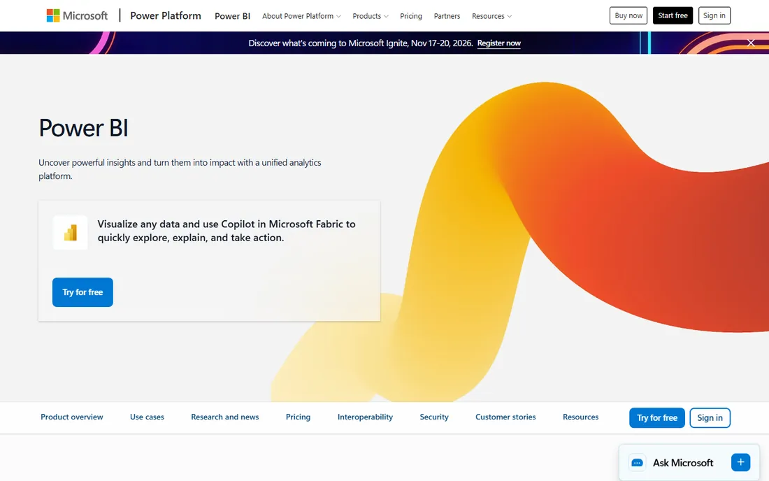
Power BI brings enterprise BI to Microsoft shops at aggressive per-user pricing: dashboards, reports and dataflows integrated with Excel, Teams and Azure. The free desktop tool is genuinely powerful. Adoption is massive because the price and integration are hard to beat.
Complex data models need real expertise, and non-Microsoft environments get less value. For organizations standardized on Microsoft 365, Power BI is the obvious dashboarding choice.
What we like- Affordable per-user pricing
- Deep Microsoft 365 integration
- Huge adoption
Watch out for- Modeling complexity at scale
- Microsoft-centric
Starting priceSee website
Free planFree trial
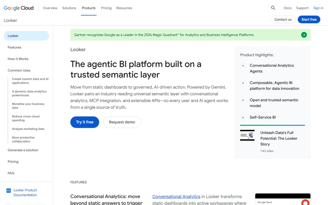
Looker, now part of Google Cloud, defines metrics once in LookML and lets everyone explore trusted data: the governed semantic layer eliminates "whose number is right" debates. It shines on BigQuery and cloud warehouses, with strong embedded analytics for customer-facing dashboards.
Someone must build the LookML models; it is not self-service from day one. For data teams that want one version of the truth on modern warehouses, Looker's governance is the differentiator.
What we like- Governed metrics layer (LookML)
- Great on BigQuery
- Embedded analytics
Watch out for- Requires LookML modeling
- Google Cloud alignment
Starting priceSee website
Free planFree trial
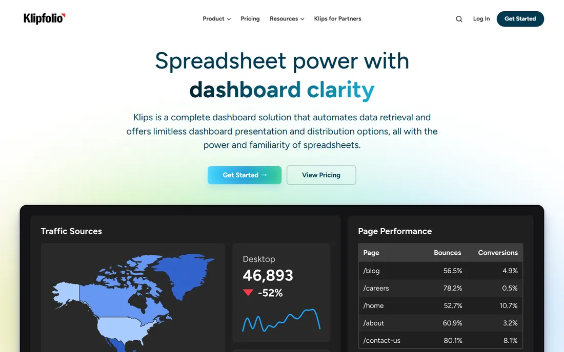
Klipfolio builds custom KPI dashboards from hundreds of integrations: marketing metrics, sales data, support stats and custom sources in one view. Agencies love white-labeling client dashboards. The formula language handles complex calculations.
Advanced work has a learning curve, and the ecosystem is smaller than Tableau or Power BI. For teams and agencies needing custom operational dashboards without BI overhead, Klipfolio's flexibility fits.
What we like- Flexible dashboard builder
- Many integrations
- Good for agencies
Watch out for- Learning curve for advanced formulas
- Smaller ecosystem
Starting priceSee website
Free planFree trial
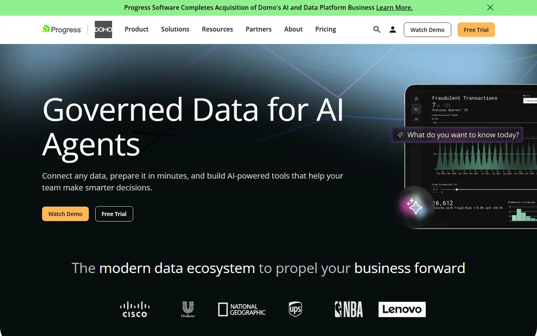
Domo is a business cloud platform: data ingestion, transformation, dashboards and apps in one place with a mobile-first design executives like. The all-in-one approach reduces the need for separate ETL and BI tools.
Pricing is quote-based and the platform exceeds simple dashboarding needs. For mid-size companies wanting data-to-dashboard without assembling a stack, Domo's completeness appeals.
What we like- End-to-end data platform
- Mobile-first
- Good for executives
Watch out for- Quote-based pricing
- Can be overkill for simple dashboards
Starting priceSee website
Free planFree trial
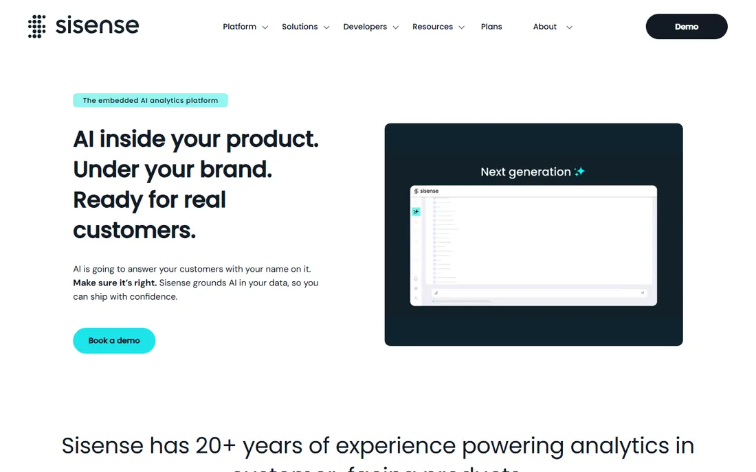
Sisense excels at embedded analytics: product teams put dashboards and insights inside their applications with APIs and white-labeling. The engine handles large, complex datasets well. Developers get proper tooling rather than afterthoughts.
Self-service exploration trails Tableau, and pricing requires a conversation. For SaaS companies embedding analytics in their product, Sisense's developer focus is the reason to choose it.
What we like- Strong embedded analytics
- Handles large data
- Developer-friendly
Watch out for- Quote-based
- Less self-service than Tableau
Starting priceSee website
Free planFree plan
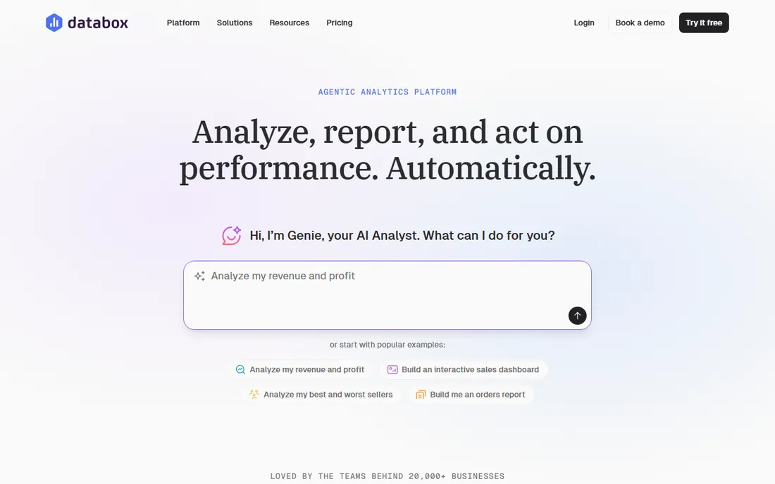
Databox makes KPI dashboards anyone can build: connect marketing, sales and finance tools, pick metrics, and get a live dashboard in minutes. The free tier covers real use. Small teams and agencies track performance without analysts.
Analytical depth is intentionally limited; complex modeling belongs elsewhere. For teams that need "our numbers on a screen, updated live," Databox's simplicity wins.
What we like- Very easy KPI dashboards
- Many integrations
- Free tier useful
Watch out for- Less analytical depth
- Not for complex BI
Starting priceSee website
Free planFree trial
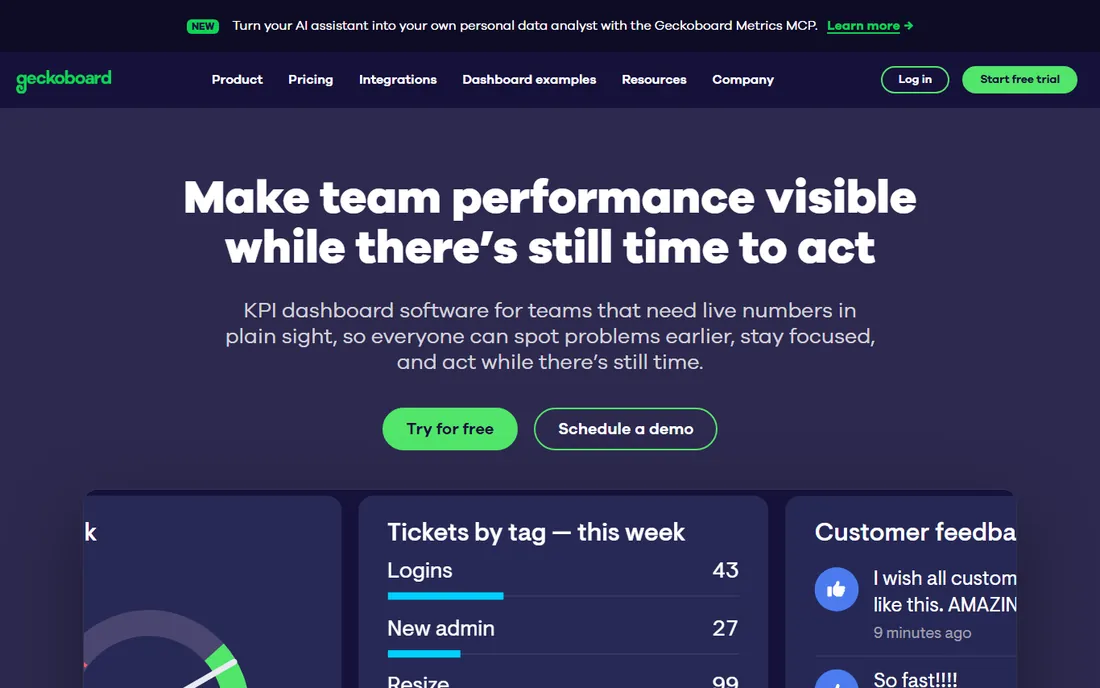
Geckoboard puts live metrics on office TVs: sales numbers, support queues, build status, big and readable from across the room. Setup takes minutes and the displays look great. Teams stay aligned when the numbers are always visible.
It is a display tool, not an analytics platform; exploration happens elsewhere. For the classic "dashboard on the wall" use case, Geckoboard does it better than anyone.
What we like- Beautiful TV dashboards
- Dead simple
- Great for office visibility
Watch out for- Narrow use case
- Not an analytics tool
Starting priceFree
Free planFree plan
Metabase is the open-source dashboard tool developers love: point it at a database, and non-technical users build questions and dashboards without SQL (or with it). Deployment takes minutes, and the free tier is the real product, not a teaser.
Enterprise BI depth (governance, advanced modeling) trails Tableau and Looker. For startups and teams that need real dashboards without budget or bureaucracy, Metabase is the obvious start.
What we like- Free and open source
- Easy for non-technical users
- Quick to deploy
Watch out for- Less depth than enterprise BI
- Scaling needs care
Choosing by use case
Executive KPI tracking: Databox, Geckoboard, Domo. Deep analysis: Tableau, Power BI. Governed metrics on warehouses: Looker. Embedded in your product: Sisense, Looker. Free and fast: Metabase. Custom operational views: Klipfolio. Most organizations end up with two: an analyst tool and a display tool. That is normal.
Dashboard design that works
One dashboard, one question. Fewer than 9 visualizations per screen. Consistent definitions behind every metric. Refresh rates matched to decisions (real-time for ops, daily for strategy). And the hardest rule: remove a metric before adding one. Dashboard sprawl kills more BI programs than any tool choice.
Data refresh strategy: how fresh is fresh enough
Every dashboard conversation eventually reaches the refresh question, and the default answer (real-time everything) is almost always wrong. Real-time data costs more in compute, complexity and fragility than most decisions justify. The right refresh rate follows the decision cadence: how often does someone act on this number. A sales floor adjusting staffing needs intraday updates. An executive reviewing weekly performance needs daily refreshes at most. A board reviewing quarterly strategy needs monthly numbers. Matching refresh to decisions saves money and reduces false alarms from intraday noise. Document the refresh rate on each dashboard so viewers know what they are looking at; a dashboard without a visible "updated" timestamp invites misinterpretation.
Batch refresh remains the workhorse for good reasons. Nightly or hourly ETL pipelines are cheaper, more reliable and easier to troubleshoot than streaming architectures. Most business metrics (revenue, pipeline, support volumes, marketing performance) change meaningfully on daily or hourly timescales; intraday fluctuations are noise. Batch also enables data quality checks before publication: validate totals, check for anomalies, quarantine bad loads. A dashboard that shows wrong numbers fast is worse than one showing right numbers slightly later. Design the pipeline with validation gates and alerting on pipeline failures; a stale dashboard that nobody notices is a silent credibility killer. Monitor pipeline health as carefully as the metrics themselves.
Streaming and real-time have their place: operational dashboards where minutes matter. Fraud detection, system monitoring, live event tracking, logistics dispatch. Even here, distinguish true real-time (sub-minute) from near-real-time (5 to 15 minutes); the latter is dramatically cheaper and suffices for most operational uses. Streaming architectures (Kafka, Kinesis, change data capture) add significant operational complexity; do not adopt them for dashboards that get glanced at in a weekly meeting. When real-time is justified, design for it explicitly: define the latency SLA, monitor it, and have a fallback when the stream breaks. A real-time dashboard that silently freezes shows yesterday's crisis as today's calm.
Caching strategy affects both performance and freshness perception. Dashboard tools cache query results to keep interactions snappy; understand what is cached, for how long, and what triggers invalidation. A user who filters a dashboard and sees stale cached data loses trust quickly. Configure cache lifetimes deliberately: aggressive caching for stable historical data, short or no caching for fast-moving metrics. Also consider the database load: fifty users opening dashboards simultaneously without caching can overwhelm the warehouse. The BI tool's caching is load protection as much as performance; size it accordingly and monitor cache hit rates.
Communicate data latency honestly and visibly. Every dashboard should show when its data was last updated and what period it covers. For intraday dashboards, show the lag explicitly ("data through 2:00 PM, 15 min delay"). Train viewers to check the timestamp before reacting; most dashboard-driven panics trace to someone reading stale data as current. When pipelines break, the dashboard should show the staleness prominently rather than silently displaying old numbers. Trust in dashboards is hard to build and easy to destroy; transparent freshness handling is the foundation. The goal is not the freshest possible data but the freshest data anyone actually needs, delivered reliably and labeled honestly.
Frequently asked questions
How much does dashboard software cost?
Metabase is free and open source. Databox and Power BI have free tiers. Power BI Pro and Tableau run tens of dollars per user monthly. Looker, Domo and Sisense are quote-based, typically thousands annually and up.
What is the difference between dashboarding and BI?
Dashboarding displays metrics; BI includes the full stack (data modeling, exploration, governance, reporting). Tableau, Power BI and Looker are BI platforms. Databox and Geckoboard are dashboarding tools. Buy the depth you need.
Can non-technical users build dashboards?
Yes, with the right tool. Metabase, Databox and Power BI are accessible to business users. Tableau and Looker reward analyst skills. Match the tool to who will actually build.
How do dashboards connect to our data?
Native connectors (databases, warehouses, SaaS apps), APIs and file uploads. Confirm your specific sources during evaluation; the connector list determines real-world usefulness more than any feature.
Should dashboards be real-time?
Only when decisions are real-time (ops, support, sales floors). Most business dashboards do fine with hourly or daily refreshes. Real-time costs more in compute and complexity; do not pay for it by default.
What about embedded dashboards for customers?
Sisense and Looker lead in embedded analytics with white-labeling and APIs. Tableau and Power BI also embed. Evaluate the embedding pricing model separately; it often differs from internal BI pricing.
How we chose
We compared the dashboarding tools businesses actually buy, from free open source to enterprise BI. Pricing is per-user or quote-based across the category. We weighted ease of dashboard building, data connectivity, analytical depth and fit for different team sizes. No hands-on testing was performed; assessments rest on documentation and public reviews.
Sources we checked (9)
- https://www.tableau.com/
- https://powerbi.microsoft.com/
- https://cloud.google.com/looker
- https://www.klipfolio.com/
- https://www.domo.com/
- https://www.sisense.com/
- https://databox.com/
- https://www.geckoboard.com/
- https://www.metabase.com/
Is your product missing or out of date?
We review this list regularly. Vendors can request a listing, send updated pricing or ask about featured placement.

Shihab Mia · Founder, Rankite
Shihab has spent more than a decade helping SaaS and e-commerce brands grow through search. He writes Rankite's software buying guides from pricing pages, documentation and public user reviews. More about Shihab.